Insights
A Different Perspective
A new direction transforms a magazine

Visual direction is a crucial component of storytelling. For this reason, I have long advocated for a working collaboration on story development between an art director and a magazine editor. These two perspectives are essential to a thoughtfully orchestrated narrative, and in some cases, transformative.
When the team at Brooklyn Law contacted 2communiqué, they were looking for a design firm to help elevate their alumni magazine’s cover and features. Although filled with interesting stories (think the laws of artificial intelligence and bail reform), the visual presentation was flat and it lacked an editorial approach.
More times than not, we are brought in to help re-envision an alumni magazine and asked to make it feel “more editorial.” What does this mean exactly? Different from the strategy typically used in multi-page brochures and annual reports, an editorial approach focuses on understanding the tone and direction of the featured stories.
This understanding is developed in response to questions asked by the designer and answered by the editor. For example, most magazine editions will feature a profile; we ask, what is that person like? Why are they being covered? What is their story and how can it be captured in a portrait? If the profile is focused around an issue, what is the spin? Why is it important for the readership? How should it be presented? All these questions must be answered to develop a true understanding of the story.
Also important is selecting the right photographer or illustrator; this requires reviewing portfolios and curating a sample of work that represents the story’s approach. Will your subjects be serious or smiling? What illustrative styles fit with the tone of the editorial? In general, it is useful to have a visual direction defined as part of the magazine’s style guide. Doing so gives the team a benchmark for visual approach and keeps the project on brand. For the record, nailing the tone is just as important for typographic solutions.
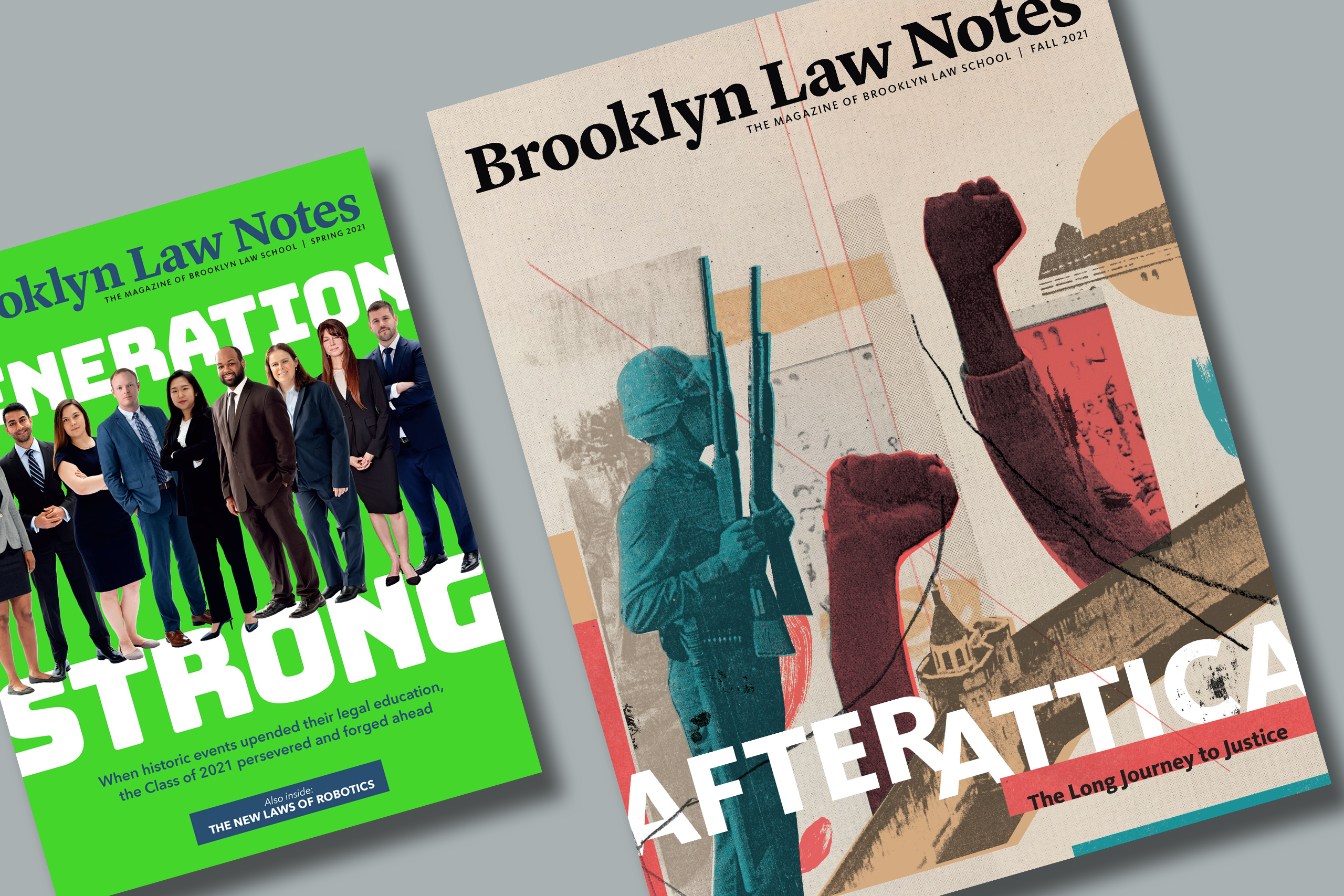
The fall 2021 issue of Brooklyn Law included a 50-years-later reflection of the Attica Prison riots and a profile of an influential faculty member. Working with a tight budget, we knew that choosing the right illustrator and photographer would be key to developing the issue’s tone and direction.
We have long admired the work of illustrator Mike McQuade and felt he was a perfect fit for the cover story on Attica. We also felt strongly that his style was a beautiful complement to the archival photography that would be used for the story. In fact, during Mike’s visual research for the piece, he found an incredible resource for creative common images: Attica. This bonus discovery helped us to create a visually impactful story within the constraints of our budget.
When it came to selecting a photographer, we needed someone who could capture the spirit of Professor Roberta Karmel, the trailblazer public servant and scholar. Although it was our first time working with photographer Laura Barisonzi, we were familiar with her work. Before Laura went on the assignment, we talked at length about the importance of representing Karmel’s strength; we wanted her presence to command the page.
The outcome of all these collaborations— illustrator, photographer, and the team at Brooklyn Law—is a topical publication with a more sophisticated tone. Despite the fact that the logo, palette, and typography remain unchanged, it feels as if the magazine has been redesigned. It hasn’t.
It’s amazing what a different perspective can offer.