Insights
What Makes a Magazine?
A conversation with Jeremy Leslie, magCulture
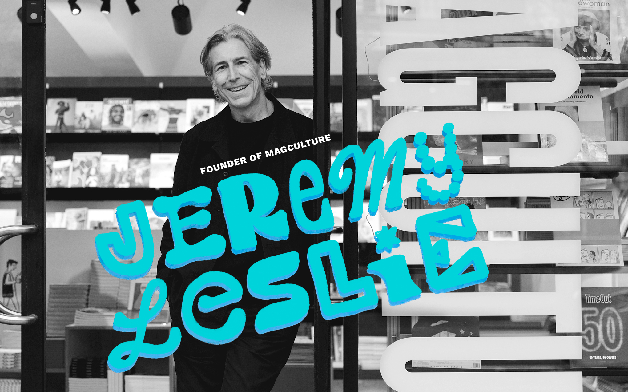
If there is someone who knows a thing or two about magazines it is Jeremy Leslie, author and founder of magCulture—a shop, event, and publisher of a journal and podcast. Kelly McMurray, founder and creative director of 2communiqué, talked with him about the world of independent magazine publishing, a thriving and creative industry.
KM: What is a magazine?
JL: It is something published in a series. Traditionally it is an object that you can flip through. We have a familiarity with this format. Beyond the printed piece there is a range. It can be an object like, nice magazine, a logo carved into wood on one side and an ad on the other. That was it. Or an experience like Pop-up Magazine where you go to a theater and experience authors reading and artwork being created.
KM: Pop-up Magazine was a transformative experience that changed my perception of what a magazine is. It incorporated the content of a traditional magazine—editor’s note, advice column, photography and illustration, essays, and advertising—into a live event. I also love that it isn’t recorded—that you have to be there to experience it.
I had never considered that what distinguishes a magazine is that it is a series. How often does a publication need to be published to be considered a magazine?
JL: There's two parts to that: How often should it be created and how many issues does it take before it becomes a magazine. A new magazine, when it launches, is very rarely the finished item. It takes a number of issues for it to sort of, almost, sort of grow into itself.
Most of the magazines we stock publish quarterly, three times a year, or biannually. Part of that is the quality. There has been a shift away from quick and dirty monthly churning out. You really can't compete with the internet and digital. So better to drop back and compete on quality and depth by publishing a quarterly or biannual.
KM: That is a great point about publishing less frequently and focusing on quality. I think some magazines get stuck doing things as they have always been done.
Who is doing interesting work?
JL: There are a lot of exciting things going on right now. The one magazine that I think is doing really interesting stuff is Interview magazine in New York. It also has an interesting story. It was launched in 1969 by Andy Warhol and at that time it was counterculture and ahead of the game. It has been through different iterations over the years, and it's had importance and less importance. Right now, it's really, really exciting what they're doing.
KM: Independent magazines are exploring and pushing boundaries more than most consumer magazines. One of the magazines I wanted to note is Emergence. What I find interesting is that it's an annual magazine that publishes digital first. The print piece takes advantage of printing with different papers, and is a tactile experience and an object you want to keep, while stories are published weekly on the website.
The sustainability of print is getting harder with paper prices and mailing increasing every year. There is passion behind indie magazines but are they sustainable?
JL: There are shifts in terms of being published less regularly, like an annual rather than monthly or weekly, which would be completely unsustainable; though an annual is kind of crossing over into the book market. But what we're talking about is publishing and making an object that somebody wants to collect, and going to engage with. It's very much a tactile experience, as opposed to the digital side of things.
I think more and more, we're seeing publishers and people who have a story to tell, wanting to use both print and digital, and take advantage of the strengths of both formats. I remember gal-dem, published from here in London. It was initially a digital-only project, but they added the magazine.
Still, when you go into a meeting, you can talk about how many clicks you've got on your website and your reach and all audiences. But when you get the magazine out, it is the piece that people fix on, and it empowers the rest of the project. That's the key.
In terms of being sustainable, it is more complicated than ever. It used to be relatively simple—sell as much advertising to pay for the overhead, and the copy sales were your profit (that is a simplification, of course). Nowadays, you're much more likely to be part of a sort of a diagram of an ecosystem—you're doing events, consultancies, writing for other publications—there's all these different things that come together. At the very heart of that ecosystem is a print magazine that empowers and provides authority for the whole project. But it's the other parts that actually power it financially.
KM: I love getting the magCulture Boxset quarterly. Each one of the publications in it is a different experience. In the last boxset there was the oversized, two-color Civilization; Paper Boy, packaged in an envelope with a very tactical cover stock; and other more journal-like publications. Independent publishing seems to have two different aesthetic approaches; the restrained typography paired with visually rich photography, like B; or a completely different aesthetic like Interview where the type is experimental, pages are layered with color and images. As someone who has been designing magazines for 30 years, I'm interested in the aesthetic of the latter. When I look at a publication like No Man's Land I find the design to be chaotic.
I'd love your insight on these two different visual directions.
JL: They are interesting to me. No Man's Land sort of spans the two, and you're absolutely right—there's a lot of stuff going on. There is a generation exploring, like Kurt Woerpel / Interview, Chloe Scheffe / Here magazine. They're doing what has been promised in publishing for a long time—going back to basics, making things by hand, scanning it, and putting it into your computer—really taking it to extremes and really making a kind of fresh aesthetic out of it. It is very ’xine orientated in its rawness, yet takes advantage of the best typefaces. Interview is very deliberately kind of thrown together, layered and worked, and they use some very new typefaces (I think, exclusively Commercial type, who have been at the forefront of typographic in New York for some time). They are taking that kind of ’xine approach—using technology, the best photographers, the best stylists—for their cause. Which is fascinating.
A direct contrast is the modernist aesthetic which has held sway for so long, especially in New York. There is a sense that there's a bunch of templates that get filled every time with some of these magazines, and there's nothing wrong with that. It is driven by the fact that there are not many people working on a publication and it's easy to set up a two column grid with the headline at the top, and repeat, repeat, repeat. What's interesting to me is that there's that side of the independent scene that is a slight kind of austerity through necessity, and a simplicity through necessity.
We're also getting more editors who are interested in the visuals as well, or else this experimental work wouldn't be happening. There's a crossover between editorial and visual—you're getting words people that have grown up just as visually aware as the designers. Equally, designers are verbally aware, textually aware. A good art director needs to be a good editor, and a good editor needs to be a good art director. That's what we're seeing with the Interview and Here.
People who have always worked with computers are really pushing what the computer can do, without taking it into the RayGun idealistic aesthetic, where the whole point was to challenge the idea of legibility. The indies can still tell their stories very clearly and also be unmistakable. Interview is very, very complex—it's unmistakably Interview. It has an identity, whereas RayGun was throwing everything out every time. We all loved it, but it was what it was. Whereas I think you look at Interview and there is a kind of synchronicity between people that are doing things differently, finding their own way, using the equipment and everything that's to their hand to really try and dig out something new and fresh.
KM: RayGun was so popular then you had designers trying to mimic that look and doing it really poorly. Designers who don't understand the history, the aesthetic, and the intent, have the potential to just create bad designs.
A lot of the in-house designers that I work with come from a marketing background. One of my goals is to educate clients about the difference between marking design and editorial design. But the design rules are becoming less defined, like No Man’s Land, where there are full color pages, gradations, chaotic type, stickers—basically a lot going on. I think it's really interesting, but is it appropriate for its audience?
JL: You've hit the nail on the head. Interview is like the original Warhol version is about celebrity culture; it parodies itself and it's laughing all the time. The whole context of the project is perfectly matched by the visuals.
Then it becomes a style; then a marketing person will say, “Hey, we really want to do this.” But if you're creating a magazine for accounting, is it the right style? How do we match those two things?
The point is—what's the message? The message in Interview is a really complicated kind of balance between the realism and celebrity worship. It is a struggle between the two elements and that's what shows on the pages. That's what's so exciting about it. Here was like a kind of travel scrapbook. The design made sense. But No Man's Land was representing a very high-end, expensive venture-capital-backed, women-only business club. It was lovely and an exciting project. But if you're absolutely honest with it, it didn't really tie in with the rest of the aesthetic or the ideals of the client.
KM: Right, there's experimentation and then there is understanding the audience. In addition, an editorial designer understands the storytelling aspect of a publication.
JL: Right. The idea that text and image design come together on the page and become an expression of what the message is—it is the heart of it.