Insights
Making a Story Uniquely Yours
How institutions made global issues their own.
The past year two of the nation’s most visible challenges, the COVID-19 pandemic and racial inequality, touched every institution to some degree. Many of my clients took the opportunity to bring these issues forward in their magazines. And rather than share the same facts that we’ve now seen in publication after publication, each of these schools found a way to make these global and systemic crises personal.
“Why this article for this magazine and this audience?” It’s an essential question to ask when considering the direction of a piece. The editorial must uniquely connect with the publication’s community—the more personal, the more tangible. And considered art direction is the key to bringing value and distinction to the approach.
THE COVER IS CRITICAL
Addressing racial inequality is not easy, but it is critical. For its fall 2020 magazine, Caleb Cochran, director of communications at St. Mark’s School chose to engage members of the institution’s community in a discussion on the issue. The editorial approached the topic head-on, asking the community how it felt the school dealt with racial inequality both in the past and present.
To complement the editorial and to create a direction that was relevant to the school, we felt that an original illustration for the cover was the best choice. Illustrator Francesco Bongiorni shrouded St. Mark’s iconic lion statue in darkness, shining light on its face to represent the school addressing its history with race. This light metaphor carried through to the interior illustration of a student opening their highly recognizable campus gates. Both pieces shined light on the school’s conversation about race.
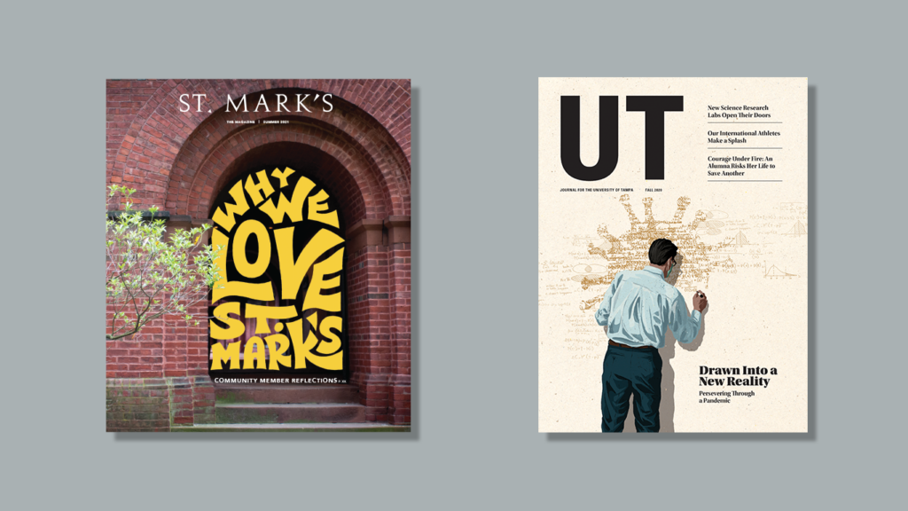
And as the world opened up this summer, the latest issue of St. Mark’s Magazine featured the story “Why I Love St. Mark’s.” It was a question one could ask of any school. At first mention, the article seemed a somewhat generic, albeit happy piece, poised to bring some lightheartedness to readers.
But after reading the dozens of replies, a clear thread was revealed. Respondents didn’t speak to the campus, athletics, or specific events—many of the things we think about when expressing pride in a school—rather, they loved the community.
We knew “community” had to come through in the cover, and the direction had to be unique to the school. After exploring numerous ideas, including student artwork and commissioning an illustrator, we all agreed that the integration of a hand-lettered headline within the iconic arches of the school was the right approach. The informal lettering captured the conversational editorial direction, while the arches felt like a community wrapping itself around the headline. It was a cover that could only be St. Mark’s.
Because community is an important aspect of independent schools, it wasn’t surprising to see editorial focus on the pandemic’s impact on other communities. Jane Bianchi, writer and editor at The University of Tampa, decided to change the editorial perspective, looking outward rather than inward. Published in the fall 2020 issue of UT Journal, “Lending a Hand” featured a compilation of stories about UT’s faculty, staff, students, and alumni who found creative ways to help others during the pandemic. Art director, Erin Dixon, worked with the illustrator Mark Smith to create a cover that represents how faculty persevered in the face of their new reality.
PLACE YOUR PHOTO HERE
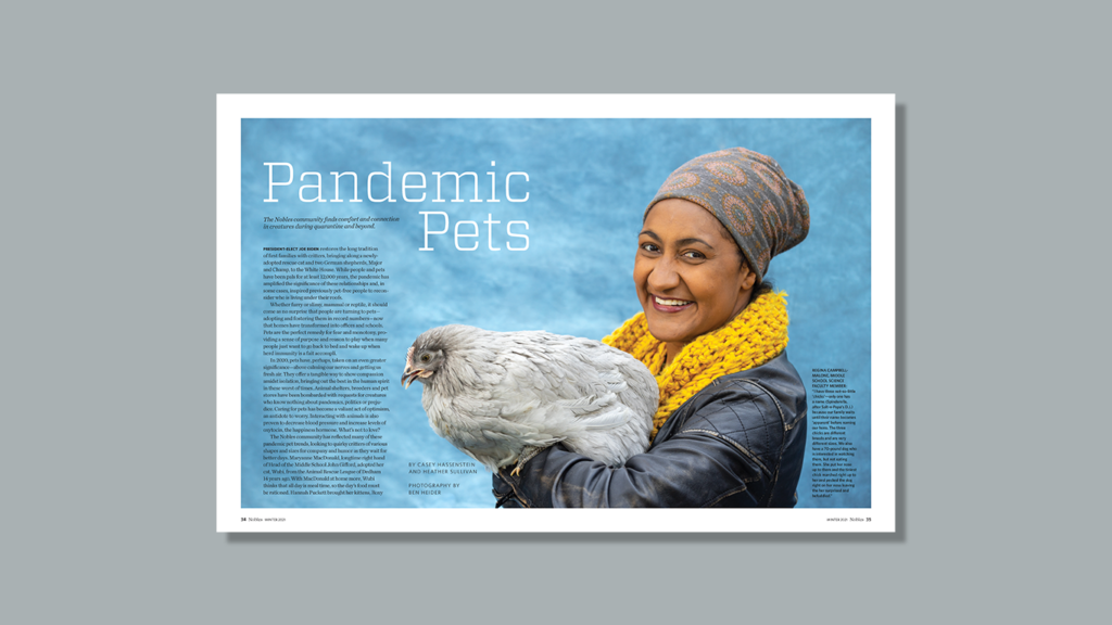
“The Nobles community finds comfort and connections in creatures in the quarantine and beyond.” As a pandemic pet owner, Director of Communications Heather Sullivan, Noble and Greenough School, was curious as to how many other people got pets over the past year. New York Magazine recently published, “No, You Beg” so we knew it was a lot. To differentiate itself from New York’s article, Noble's winter 2020 issue featured community interest stories paired with playful pet portraits taken by staff photographer, Ben Heider, in "Pandemic Pets.
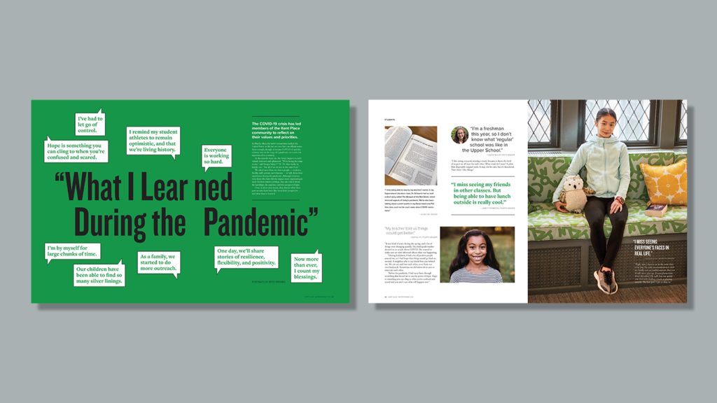
In the winter/spring 2021 issue of Kent Place Magazine, Director of Communications Rachel Naggar asked students, faculty, staff, and alumni to respond to “What I Learned During the Pandemic.” To help personalize the story, we photographed one person from each group and paired the portraits with campus photography and member-supplied photos. The end result is a story that captures the spirit of the Kent Place community.
LOOK INWARD
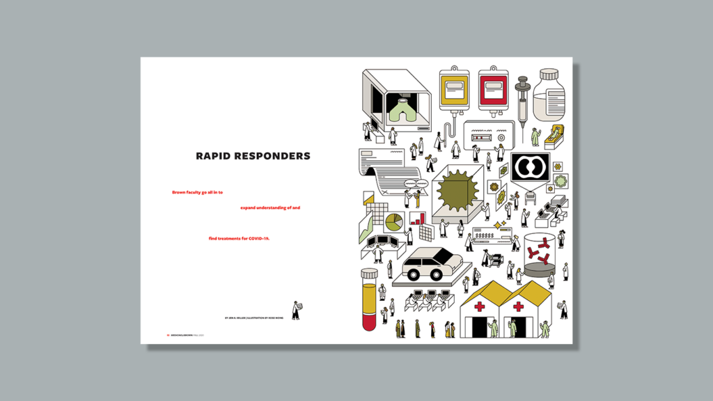
Our first sense of the oncoming impact of COVID-19 was through editors Kris Cambra and Phoebe Hall of Brown University’s Alpert School of Medicine who in January of 2020 questioned whether they would be able to meet onsite with us in March. They weren’t. Therefore, it was no surprise when the fall 2020 issue of Medicine@Brown featured “Rapid Responders,” a look at faculty research and its impact on the pandemic. Because much of the feature was not tangible, we hired the illustrator Rose Wong to capture the urgency and breadth of the research.
As a publication created for its community, an alumni magazine can provide a first-person approach like no other. Williams College held off on publishing their pandemic-focused spring issue to include an honest look at racial inequity in “Where Are We Now?” in its fall issue. Editor Amy Lovett let the voices of the community answer this question through personal essays and conversations. The platform was a powerful way to engage audiences in a difficult conversation. (Read the CASE Circle of Excellence winner for Special Issue).
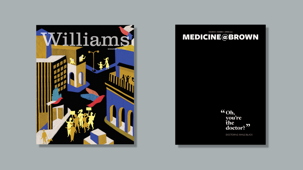
Medicine@Brown also engaged their community through story with the article “Oh you’re the doctor?” The cover line from one of the doctors became the cover line for a first person approach. This embodied that the stories in the feature came from the community and not the editor. Like the approach with Williams, the Brown editors let the personal experiences and voices of the alumni come through.
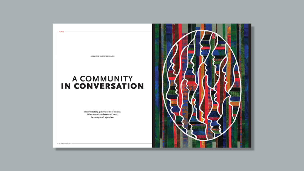
In Winsor School’s spring 2020 issue of Winsor magazine, Editor Jennifer Bub published a raw account written by alumna Patricia Elam ’71 on what it was like to be one of the school’s first students of color. With much more to be said, the fall issue continued the story line with “A Community in Conversation.”
2communiqué worked with the Boston-based Black artist, Ekua Holmes, on another publication earlier in the year, and because of her personal experience with race in the Boston area, we hoped that she would be interested in creating original artwork for this story. Unbeknownst to us, her experience was much more personal. Ekua attended an independent school in the area during this time and was friends with graduates from the Class of ‘71. This connection led to poignant pieces with tremendous depth that were uniquely created for Winsor School.
ART MAKES IT PERSONAL
Whether the topic is COVID-19, racial inequality, or other important issues, magazines are meant to publish stories that are meaningful to their readers. It has been an honor to work alongside these editors to help identify the best way to bring these stories forward and create a perspective unique to their institution. Each of these is a testament to the power of storytelling when married with thoughtful visual direction.
