Work
Redesigning a Magazine to Capture Its Culture
Noble and Greenough School Magazine
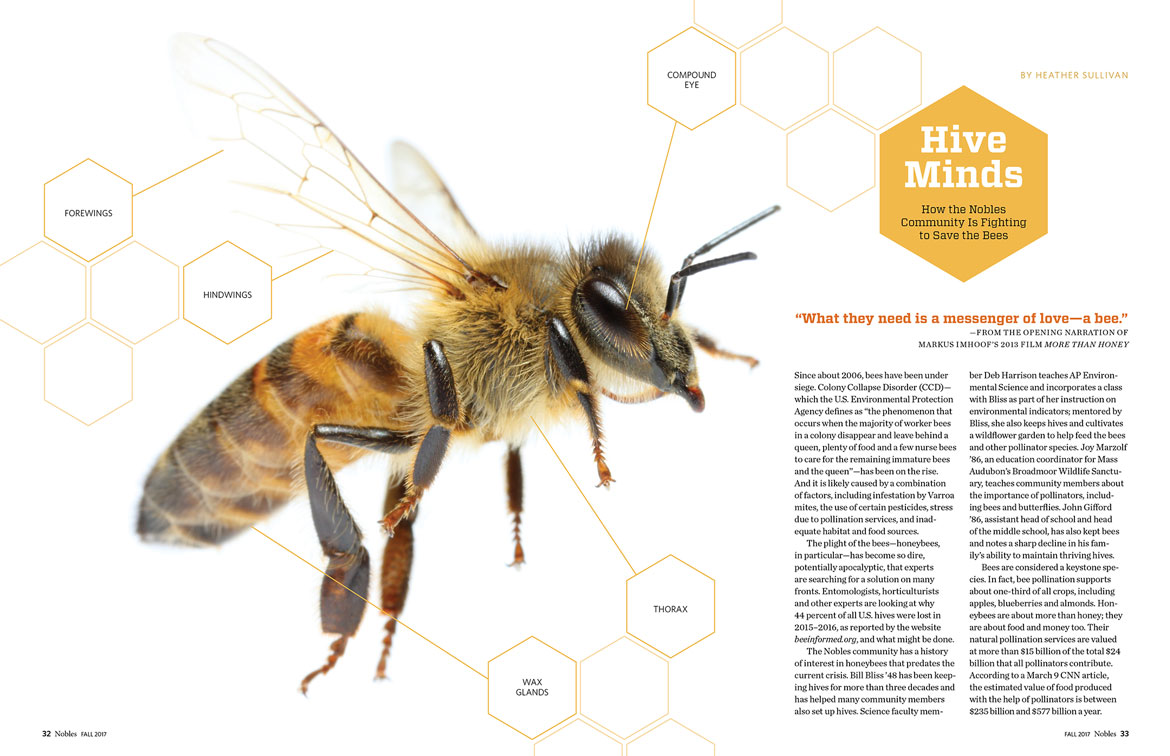
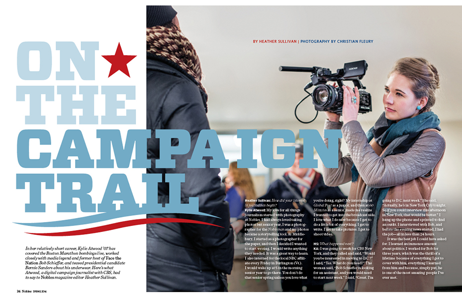
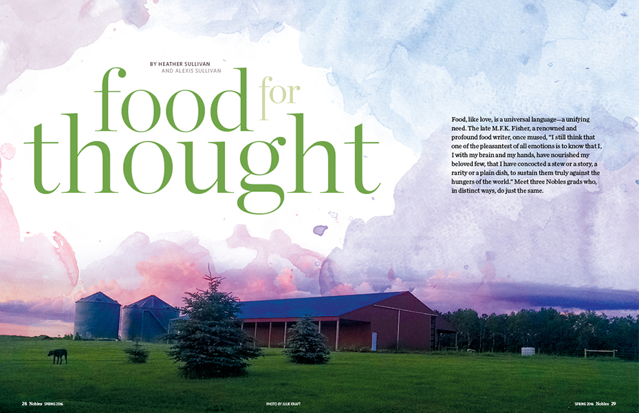
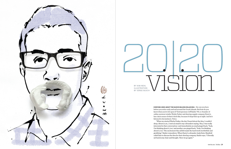
A campus situated on a picturesque hill. The glass of modern buildings juxtaposed with the charm of historic brick structures. A castle rising from the middle of campus. Girls walking the halls in riding boots and boys donning chinos. Can an independent school magazine capture this vivid culture in print? Yes it can.
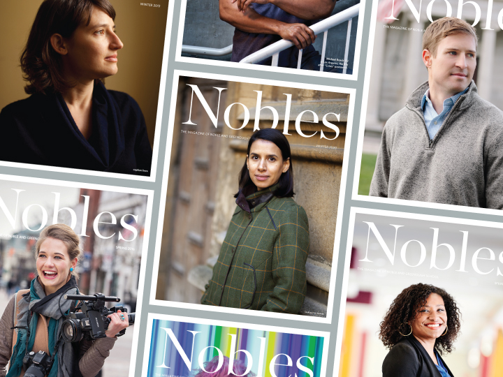
Situated outside of Boston, the independent school Noble and Greenough feels like a small liberal arts college. 2communiqué was asked to redesign the school’s magazine to reflect its striking personality.
When we first engaged with Noble and Greenough, it became immediately apparent that the school community simply refers to it as Nobles. For this reason, we felt strongly that the magazine’s name should change from The Nobles Bulletin to Nobles. Paired with the school’s friendly and poised logo, the new name better reflects the school’s essence.

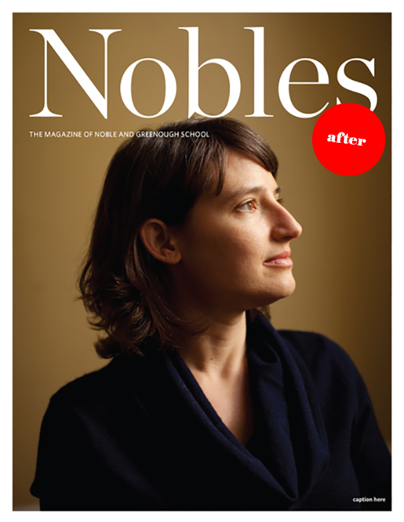
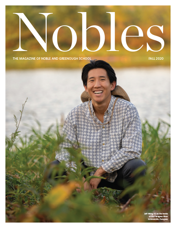
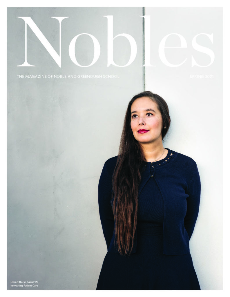
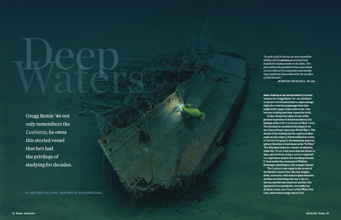
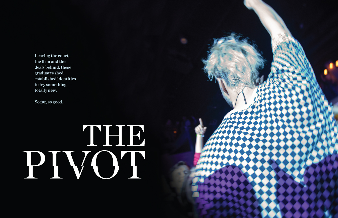
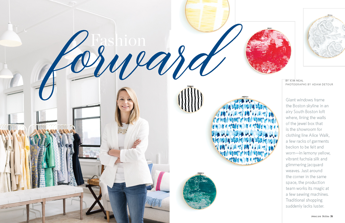
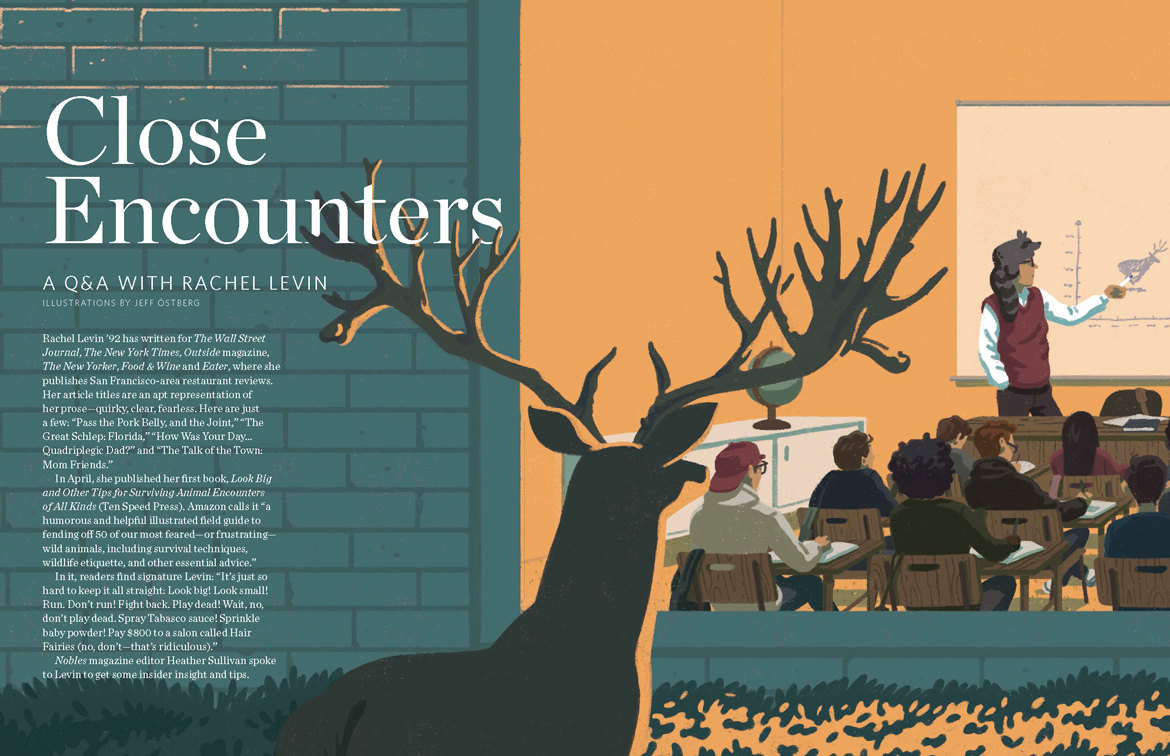
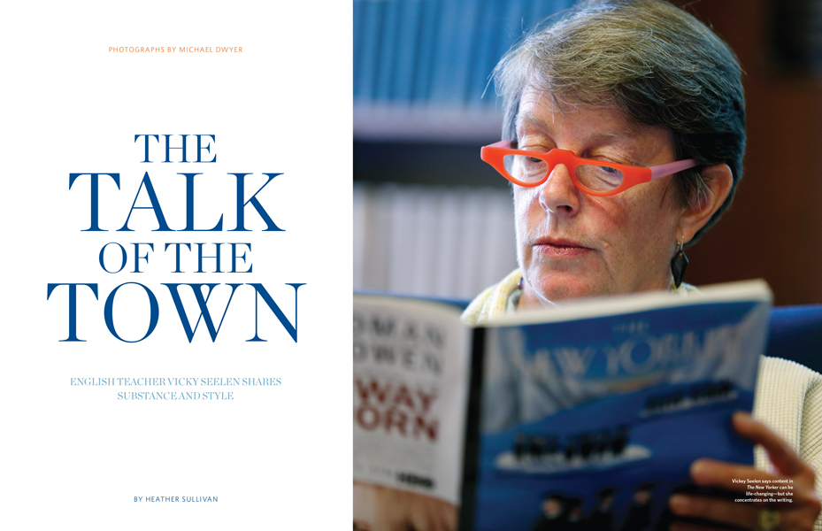
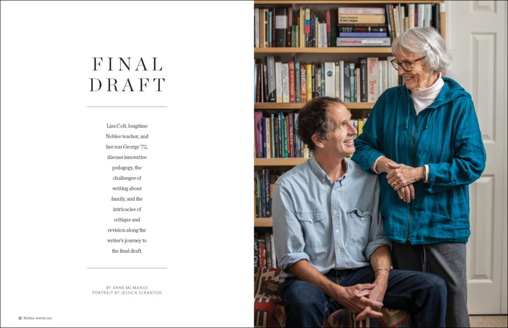
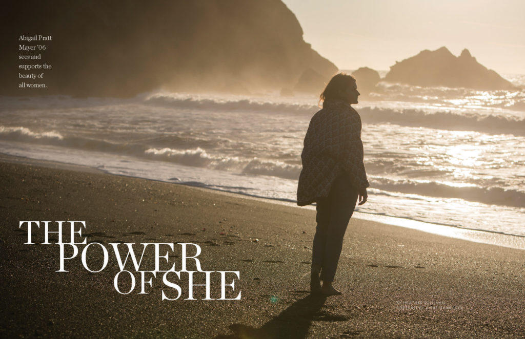
It was important that the redesign reflect the impressive impact of the school. Feature stories profile successful graduates around the country, including an activist in Wyoming, a television star in Los Angeles, and the NYPD’s first inspector general—a selection as diverse and impactful as Nobles itself.
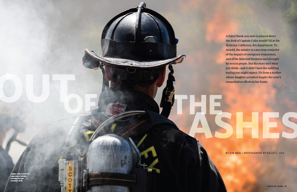
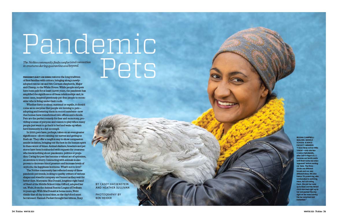

Since the redesign premiered in 2012, we have partnered with the communications team to maintain the high level of editorial excellence in Nobles.
