Work
Branding an Alumni Magazine
Bowdoin College Magazine Redesign
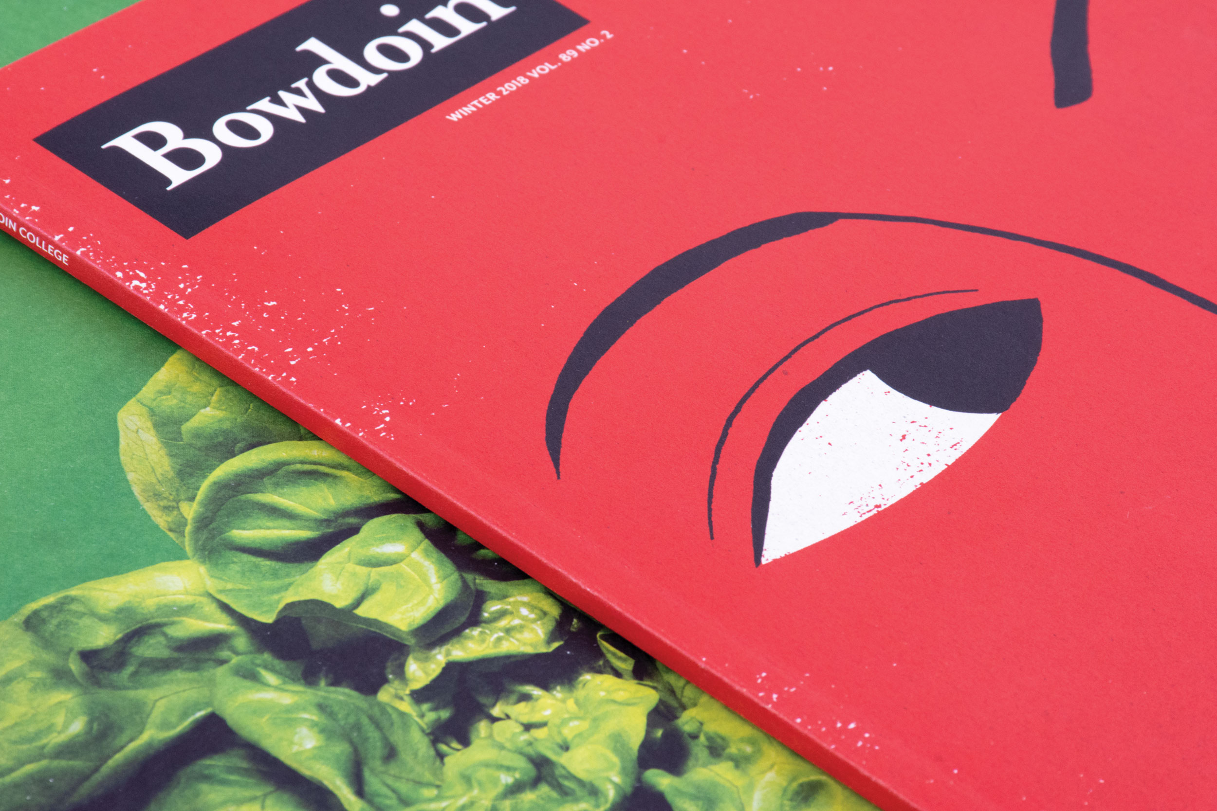
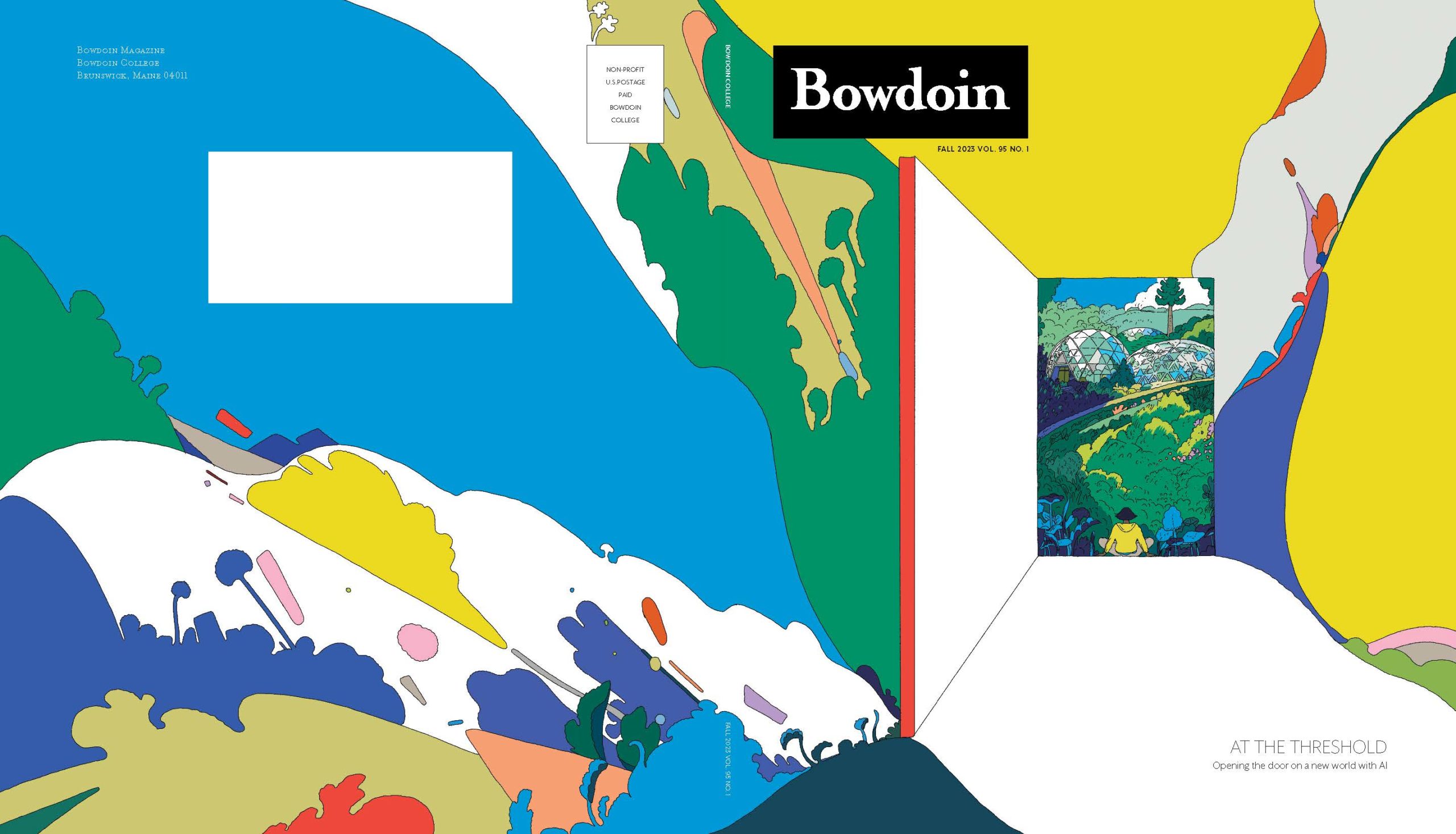
Companies like Target and Nike know the importance of consistent, strategic brand communications; it’s what sets them apart from the competition. Higher-education institutions need to follow their lead. From enrollment to alumni engagement, colleges and universities must tell their unique story to distinguish themselves from their peers. Connecting school with community through identity and brand while maintaining an autonomous editorial approach, the alumni magazine is arguably one of the most important elements in an institution’s communication plan.
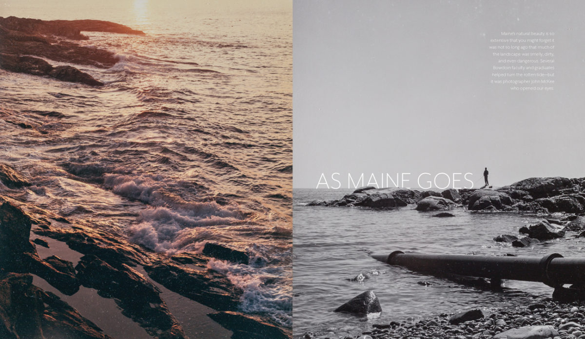
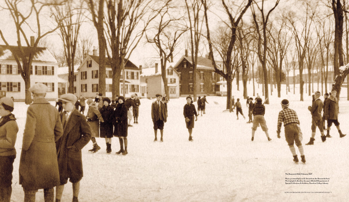
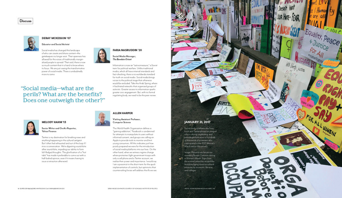
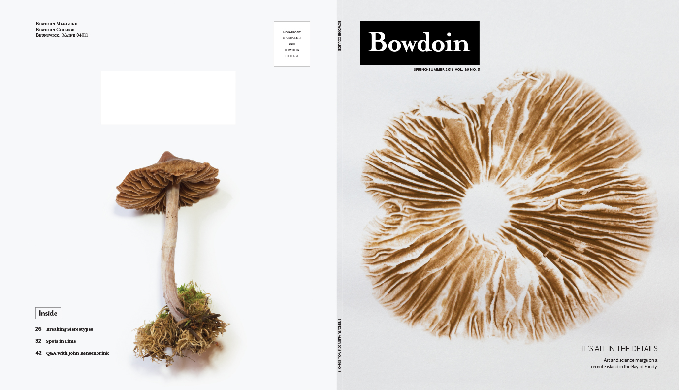
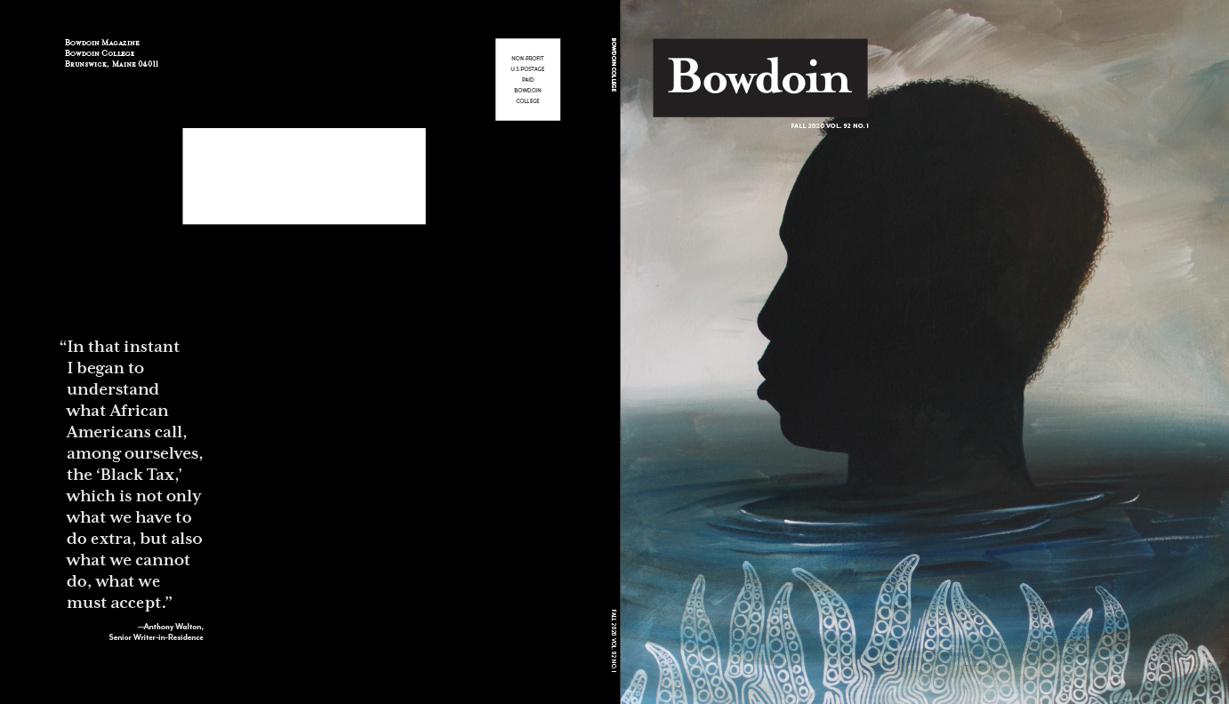
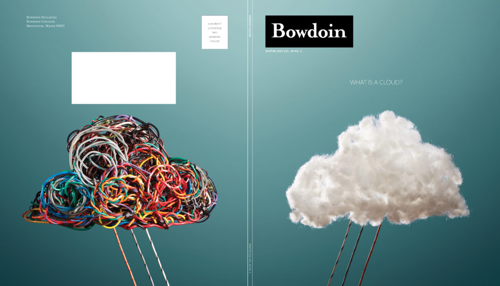
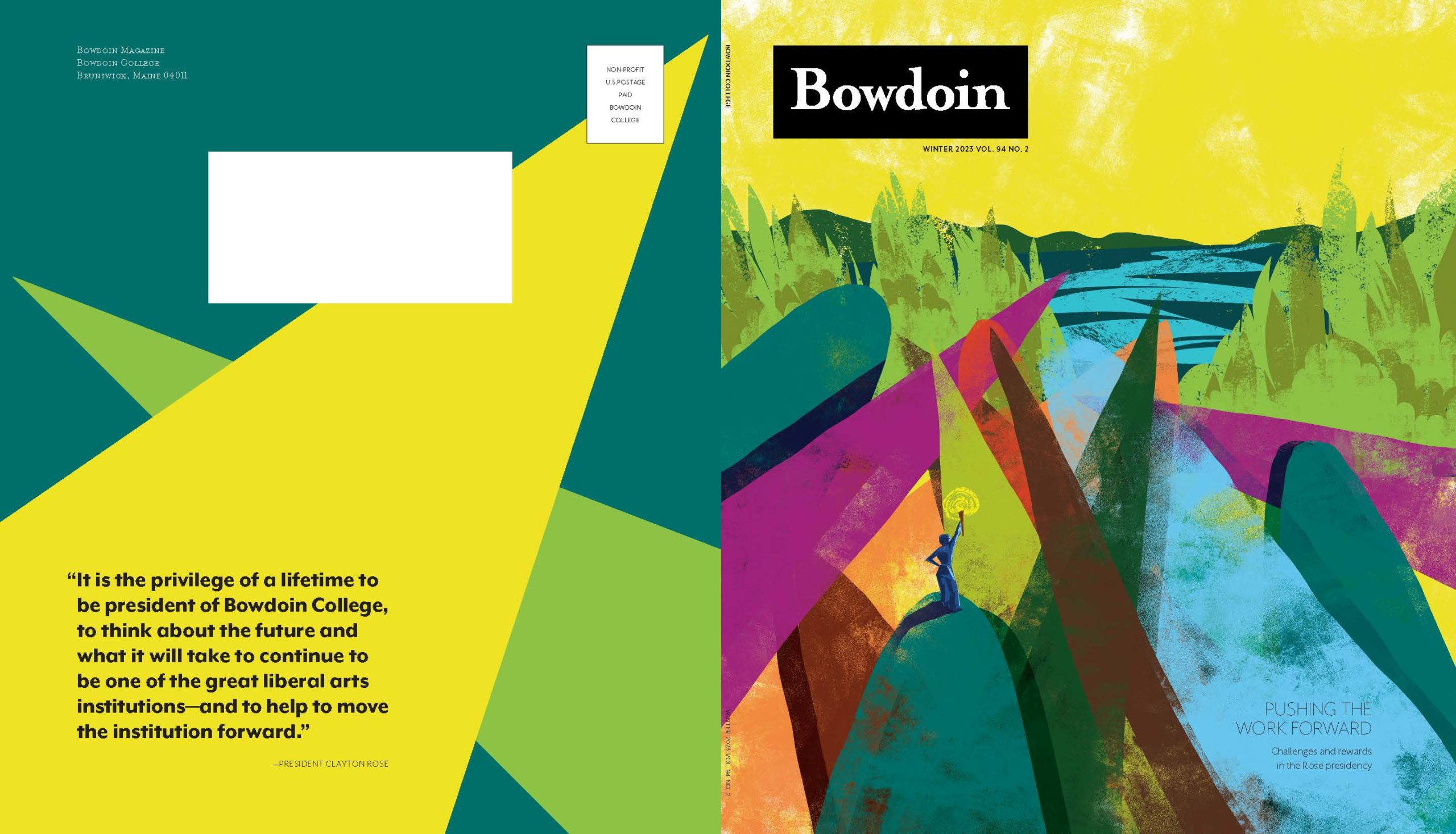
Bowdoin College, a small liberal arts college in Brunswick, Maine, produced an alumni magazine with a solid editorial framework, but the school’s communications team desired a more unique publication. Tightly packed with content and little breathing space, the existing magazine was the antithesis of the Bowdoin experience—a vibrant, educational adventure in breathtaking coastal Maine.

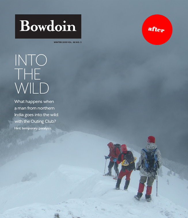
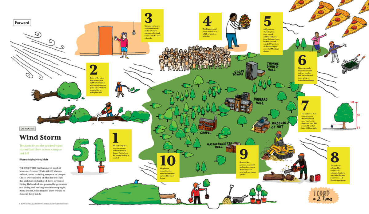
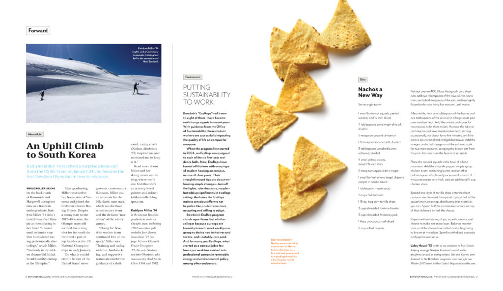
Our process began with a thorough critique of recent issues. We found the magazine stories were enthusiastic and fresh, but the overall publication was dense and cluttered. To give the communication a feeling more aligned with the Bowdoin experience, we recommended further curation of the editorial. We asked the editors to be more contemplative and intentional regarding the organization and amount of content. In addition to the critique, we developed a long-range plan for the magazine.
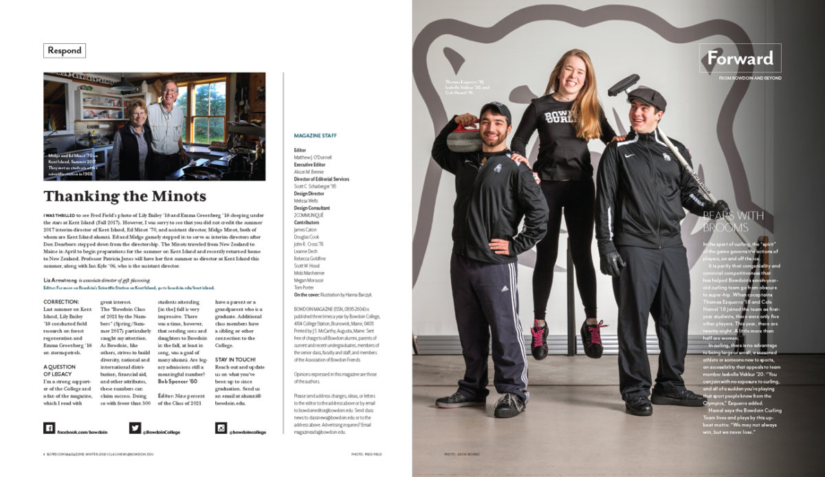
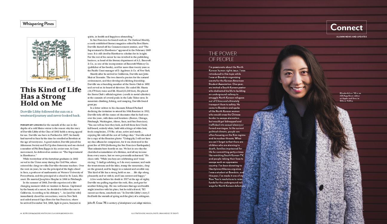
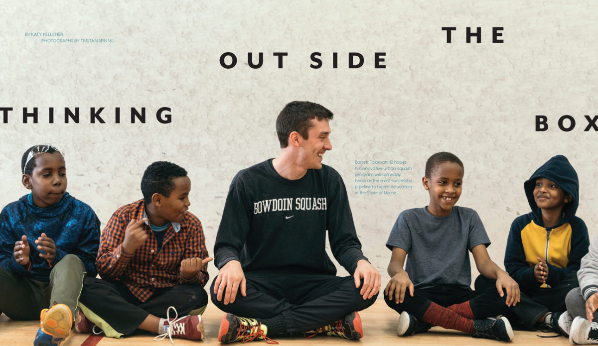
Because Bowdoin is one of the premier liberal arts colleges in the country, we knew readers of the magazine were smart and curious. And they loved Maine. Our day at the school revealed an idyllic campus in a down-to-earth coastal town. This understanding, along with the school’s identity guidelines, served as a roadmap for the magazine’s redesign. The result was an engaging and consistently branded medium that was perfect for highlighting Bowdoin’s pride and remarkable outcomes.
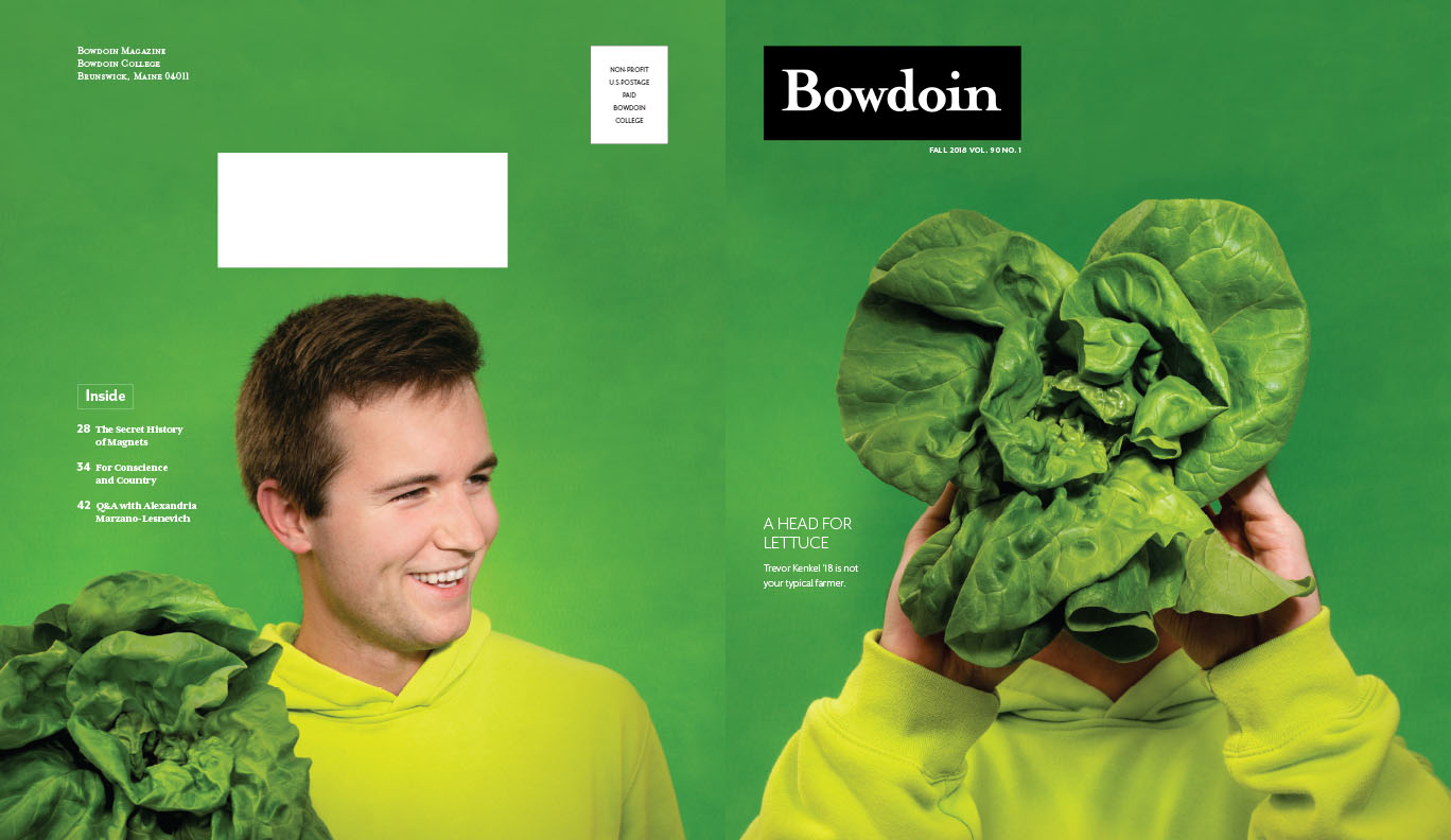
We continue to consult on cover direction, exploring multiple ideas for each story.
