Work
Aligning Brand with Mission
NativityMiguel Coalition

Does your organization’s identity and brand align with its mission? If your mission has evolved over time, as it should, then the way you present your organization also needs to evolve. This was the case for the NativityMiguel Coalition (NMC).
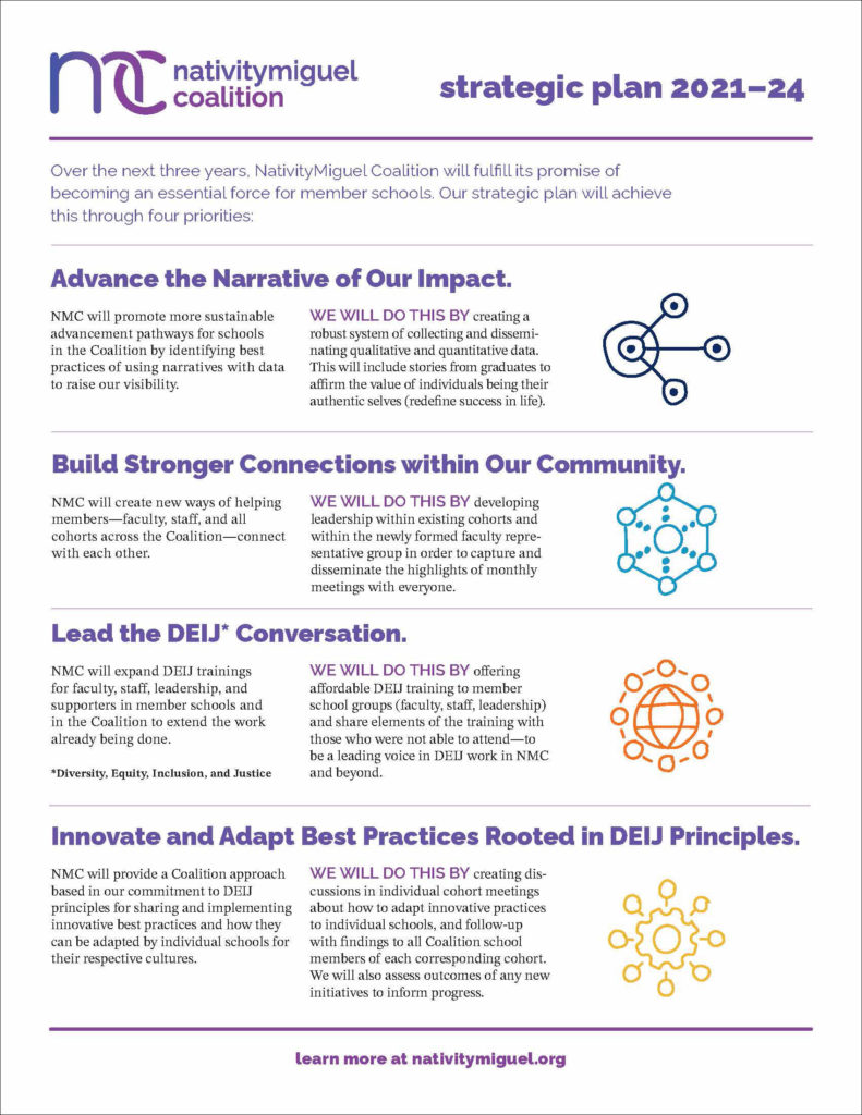
Our work with NMC began with the development of a one-page Strategic Plan. Too often, a Strategic Plan is a multipage document that few people read. Because NMC members are busy administrators at schools, it was imperative that the plan be concise and actionable. But paring down the plan meant the right language was crucial, and the work that went into developing the one page was extensive. NMC along with their partner Schooling for Hope, convened 11 focus groups, engaged six existing cohorts in monthly Zoom meetings, select 10 possible priorities from the content of the focus groups, surveyed five new cohorts (alumni, parents of alumni, parents, 8th graders, and major donors), and conducted multiple meetings with the strategic planning committee to narrow 10 priorities down to four.
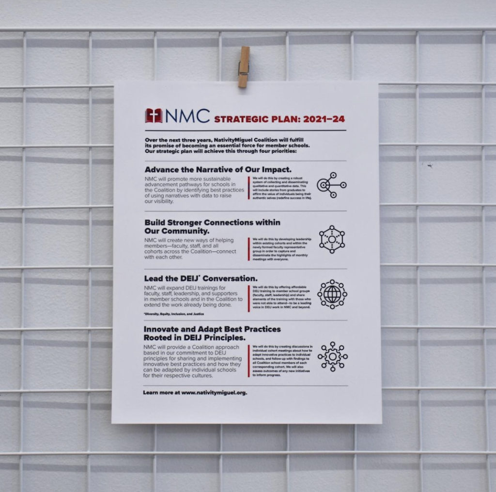
Once the plan was complete, NMC Executive Director Danny Perez and a board of volunteer members immediately began working on Priority 1, “Advance the Narrative of Our Impact.” To start, 2communiqué asked, “Is the way NMC is talking about itself clear and on message? Does the mission align with findings from developing the Strategic Plan?” The answer was no.
Our team, including Content Strategist Michelle Lansing, worked alongside NMC to develop a new mission statement that focused on asset-framed language and inclusivity. After reviewing numerous suggestions from board members, it was clear that one stood out as capturing the present and future direction for NMC.
Before: “Breaking the cycle of poverty through faith-based education.”
What wasn’t working: Deficit framed language, focus on faith over values, off target audience (schools vs. coalition)
After: “The NativityMiguel Coalition supports access to meaningful, affirming education for all members of our school communities as we endeavor together to build an equitable and just world.”
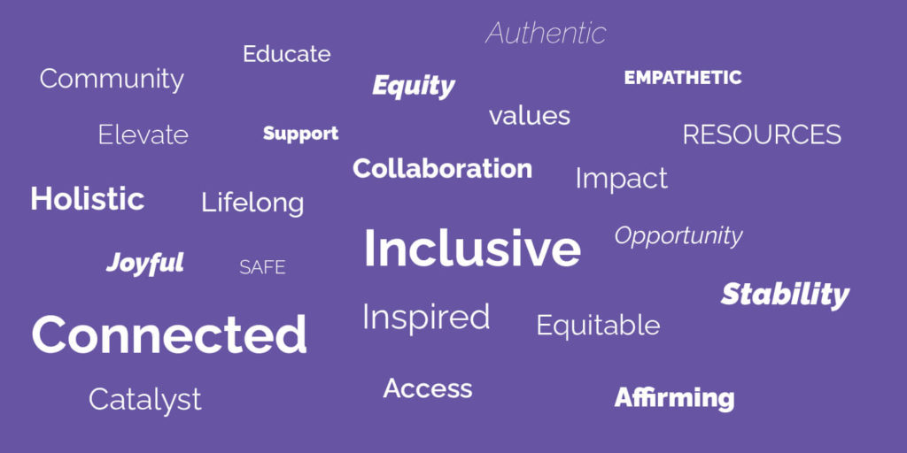
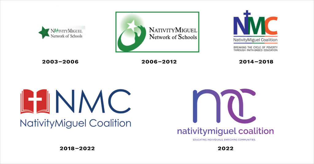
As we worked to clarify voice and tone, we also refined the visual messaging. The existing identity included a red and blue color palette, a logo with a strong religious connotation, and a lack of consistent imagery direction. Through our research we learned that NMC was considering a shift away from faith-based persona to focus more on its strong values and emphasis on community.
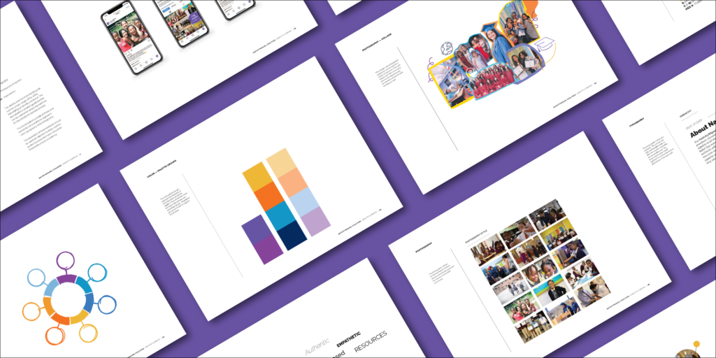
Before we began concepting logo directions, we developed a visual identity system including color, typography, and imagery to represent the asset-framed language. Photography curated from the NMC member schools complemented a more youthful and dynamic color palette. Google fonts were selected for accessible use by multiple users. And hand-drawn illustrations reinforced the approachable feeling of the voice and tone.


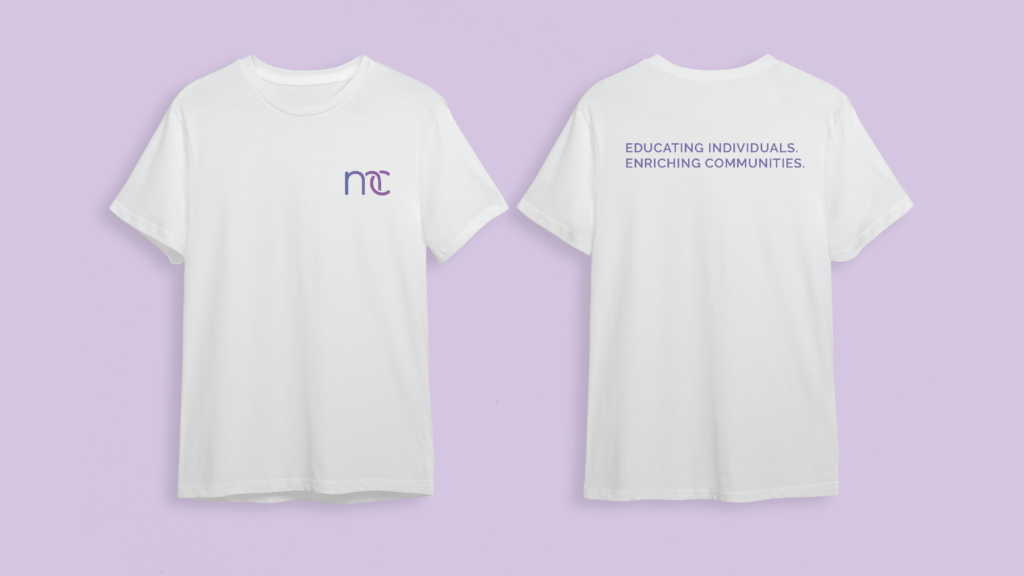
The new logo directions captured the spirit of community and connection—values at the core of NMC and its member schools. The interlocking letterform direction unanimously resonated with the NMC committee. The new identity is more inclusive and represents an organization focused on educating individuals and enriching communities.

The project culminated with a brand video that speaks to all of NMC’s Target audience members.