Work
Standing Out in a Crowd
Center for Middle Eastern Studies Rebrand
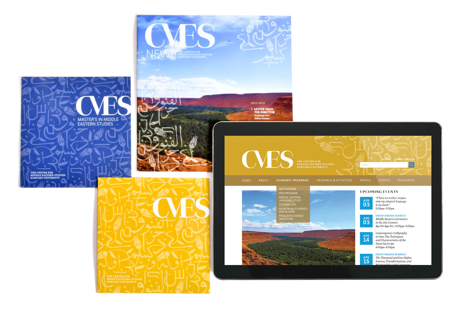
We all know that college bulletin boards are packed with posters and flyers alerting communities about campus events. Programs struggle to distinguish themselves among the clutter and capture the attention of busy students. Harvard is no exception.
When we started work with Harvard’s Center for Middle Eastern Studies (CMES), one of the goals was to showcase the center’s work and relevance. In order for CMES to increase awareness and engagement at Harvard, it needed to stand out.
Founded in 1954, the center’s goal is to foster knowledge of Middle Eastern and Islamic societies and cultures. Unfortunately, the research being done by members of CMES was not always as topical as that of other centers at Harvard. To make sure CMES stood out, we needed to ensure its research was deemed relevant.
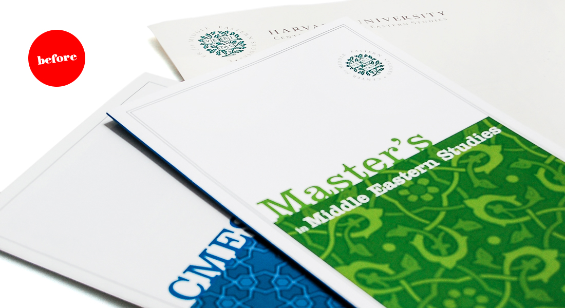
Our work began with an audit of existing CMES materials, including their website, brochures, posters, and stationery system. Through this exercise, we gained an understanding of how CMES was perceived by external and internal audiences. Although most people referred to the Center for Middle Eastern Studies as CMES, there was no formal identity developed for this naming.

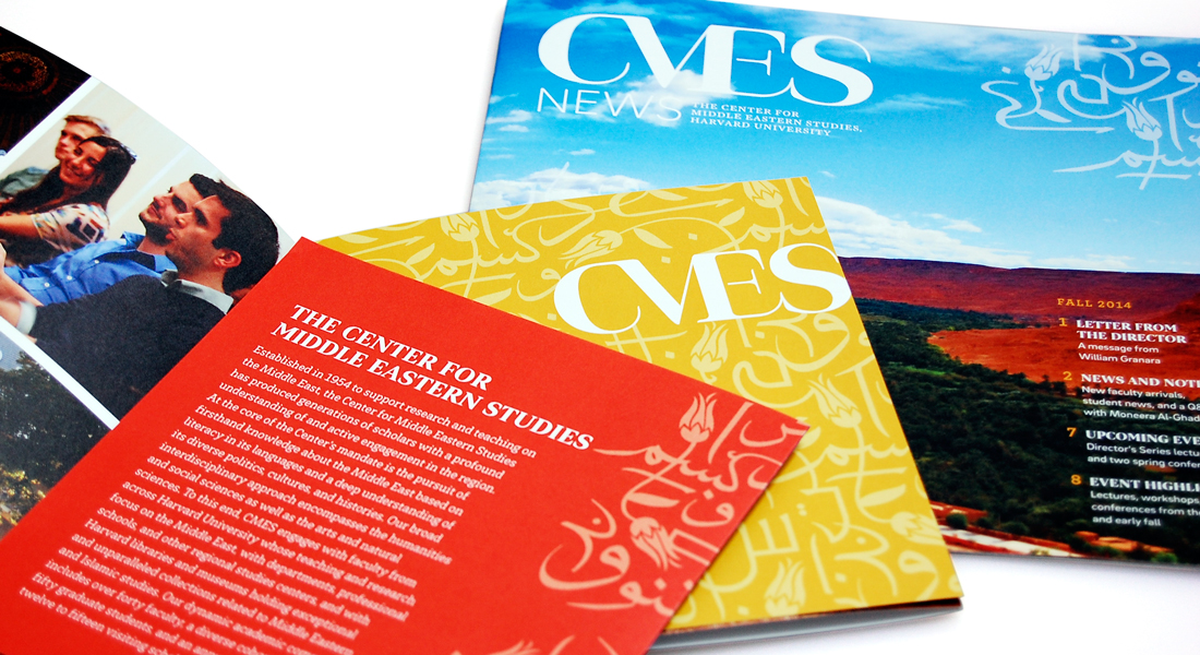
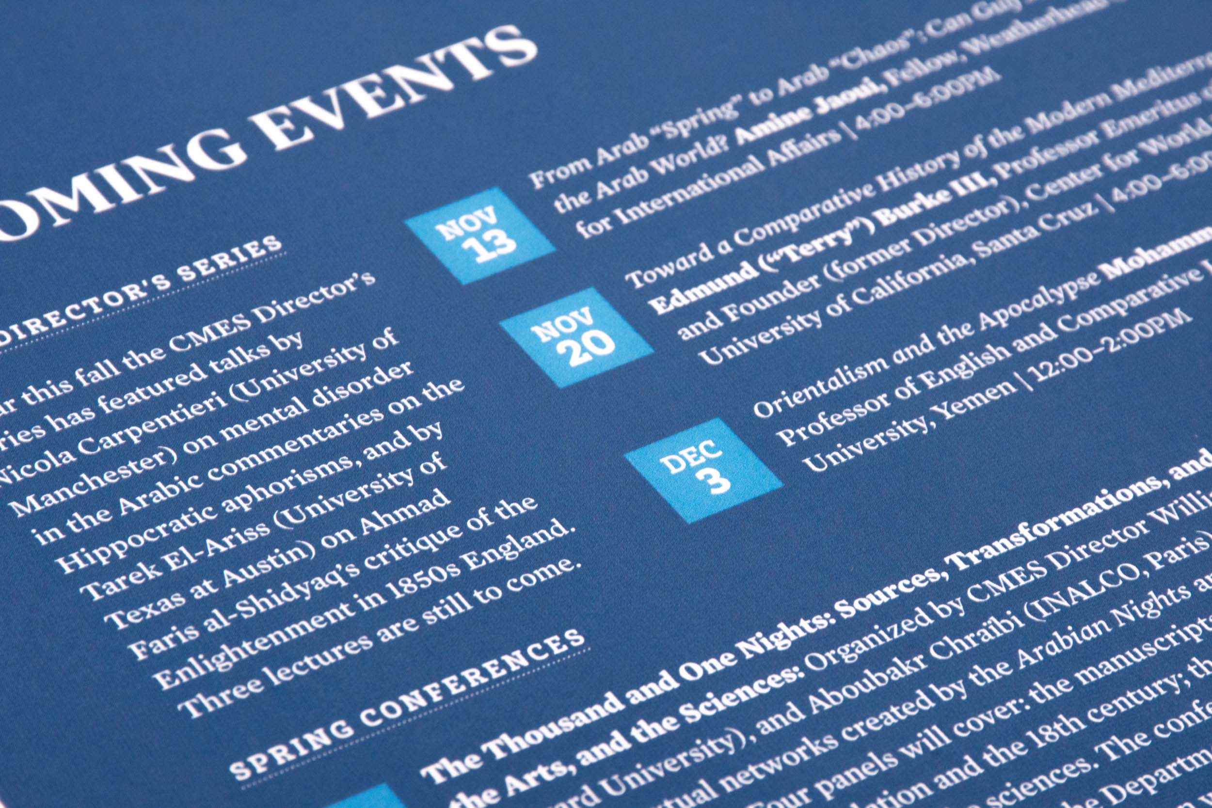
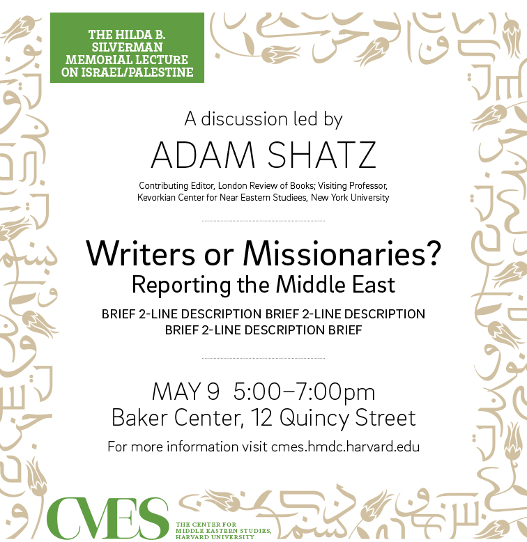
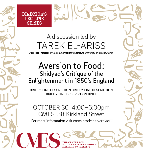
We created an identity system for CMES that included a graphic pattern inspired by Hebrew, Arabic, and Turkish script and art. The new identity was applied to the newsletter, brochures, and posters, giving the center a modern look and feel that was cohesive across all media.
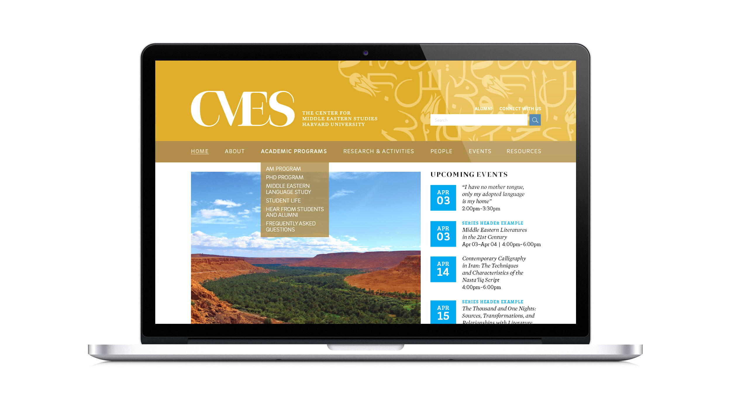
Additionally, we developed the new website using OpenScholar; this Harvard Web Publishing platform offered the community a CMS supported by the school publishing team. The new CMES identity allowed the center to stand out in a saturated digital world.
From print to digital, the rebrand gave CMES a unique identity that met project goals and got a cluttered Harvard campus to take notice.