Work
Business Meets Brand
Georgetown Business
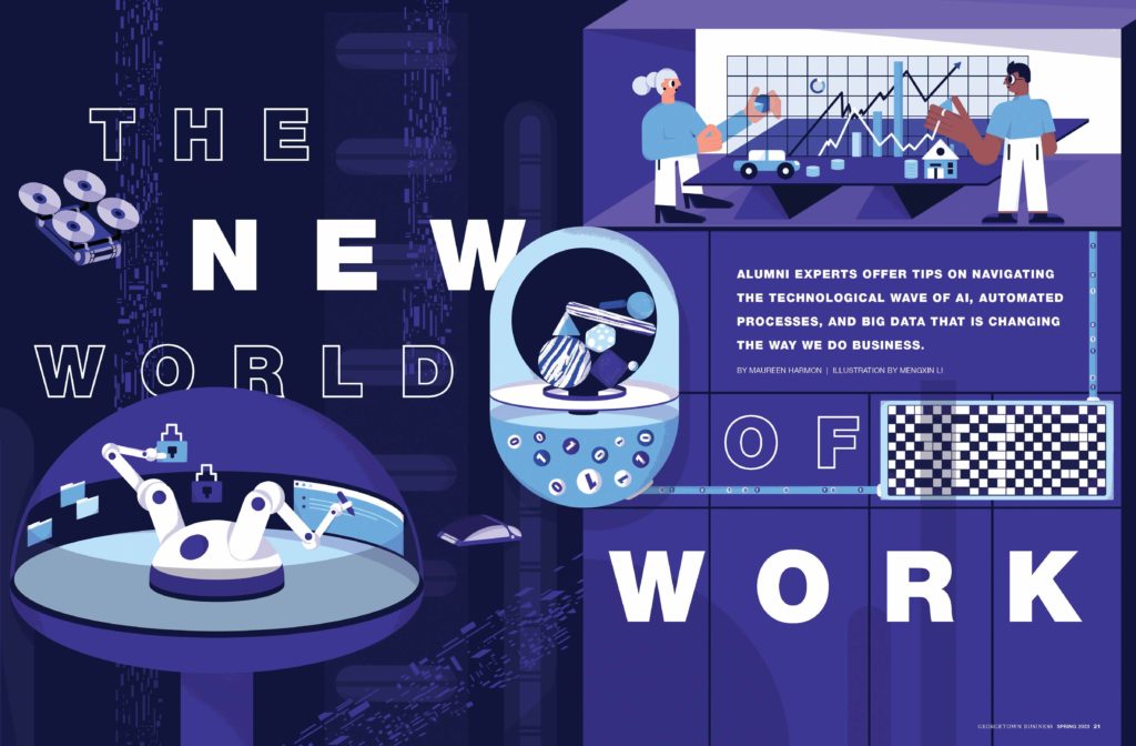
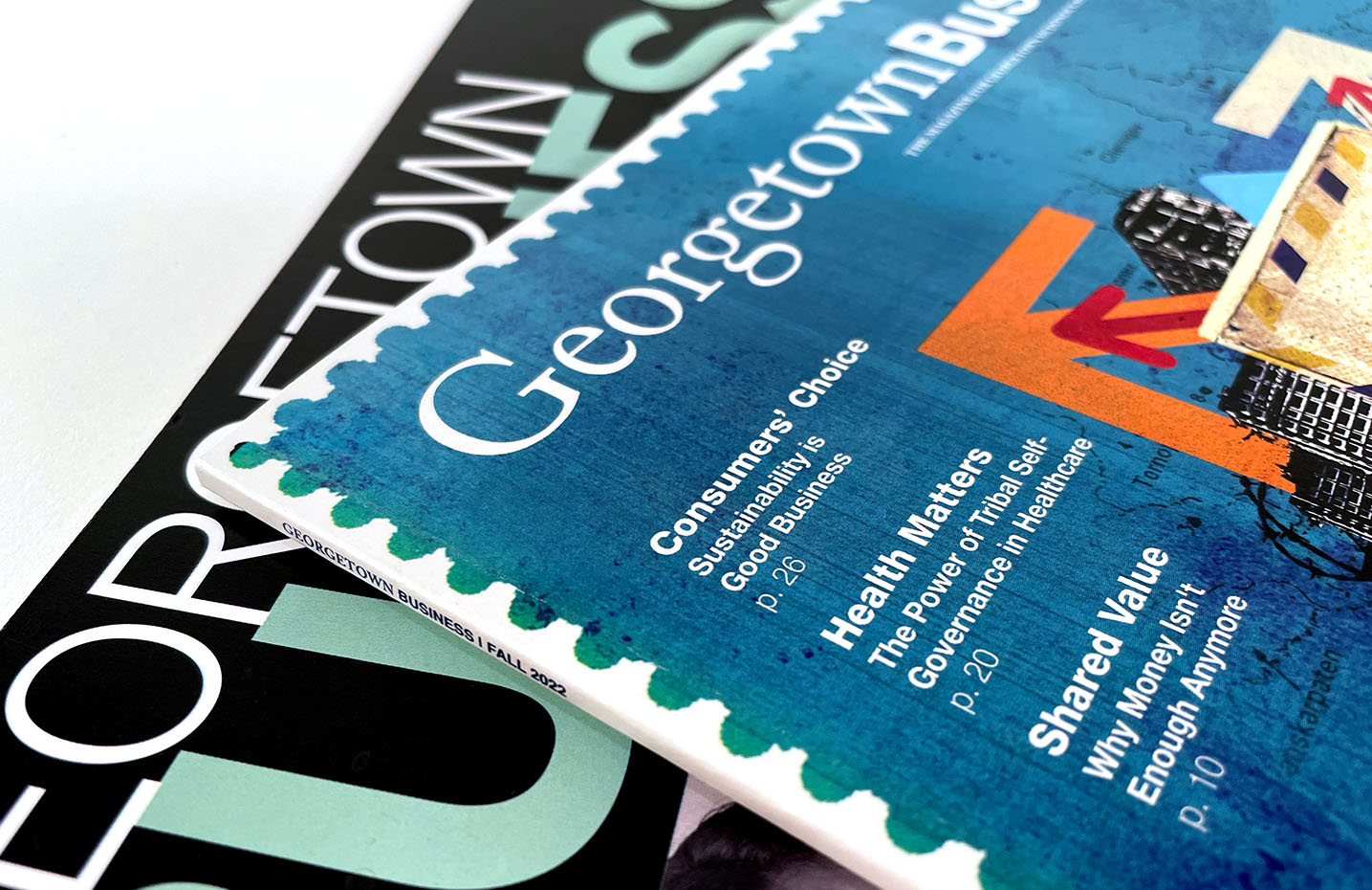
What do graduates of Georgetown University’s McDonough School of Business want to read? That’s the question 2communiqué asked itself when first engaging in a redesign of the prestigious school’s publication, Georgetown Business. While the answer may seem intuitive—stories on business and Georgetown—we were facing an extremely competitive and saturated market. We knew our response had to be relevant, engaging, and above all, uniquely Georgetown.
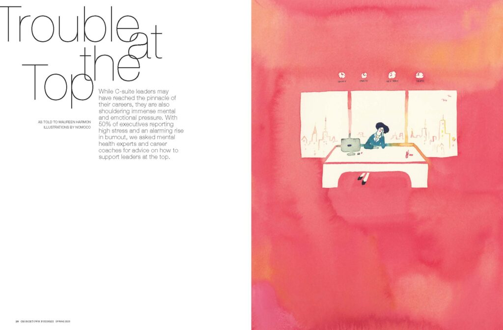
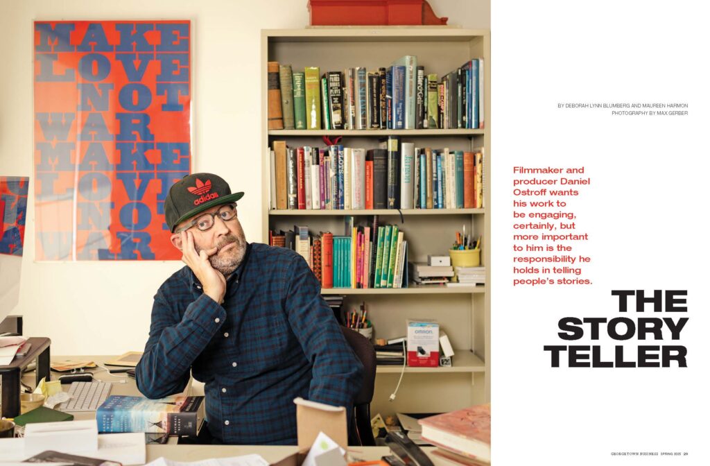
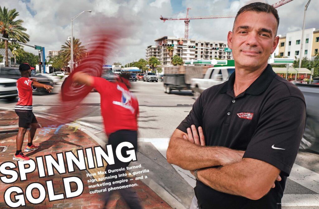
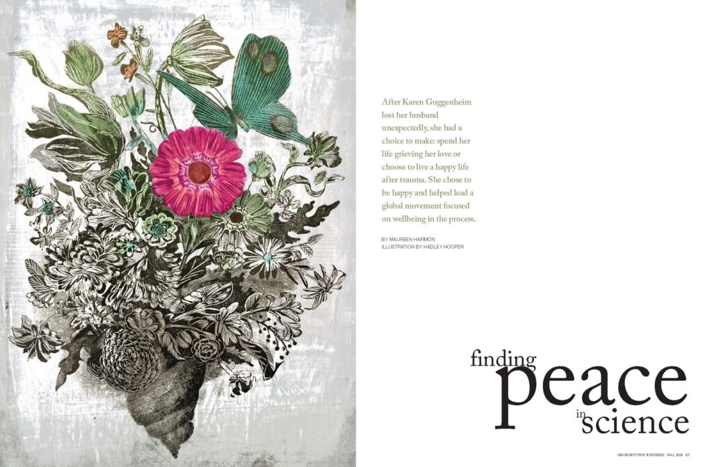
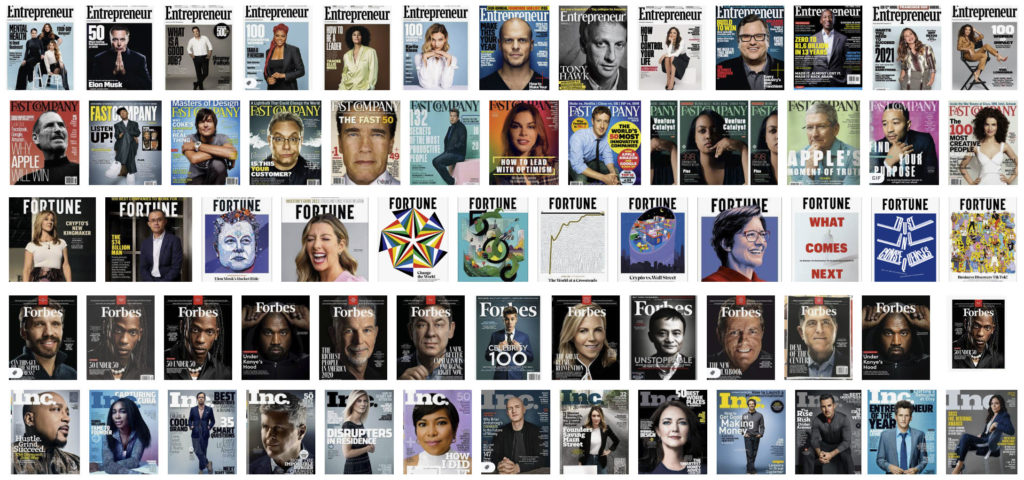
As with all of our redesigns, the work began with a competitive analysis and a thorough review of the Georgetown brand. A quick audit of the current magazine showed a tendency toward stylized portraits on white or dark backgrounds. This is one of the factors in our decision to create a totally new approach for Georgetown Business.
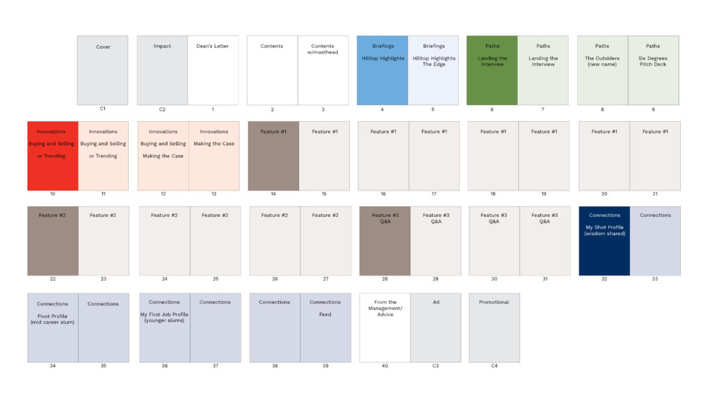
We simultaneously partnered with Dog Ear Creative on the editorial critique and plan. Their work resulted in a completely overhauled editorial structure, recommending a front-of-magazine editorial construction that first covered news, then people, and then new ideas: Briefings / Paths / Innovations. This would be followed by a feature well of varying formats (Q&As, narratives, etc.) and a back-of-book section called Connections that included “My First Job,” “ Pitch Deck,” and “Pivot.”
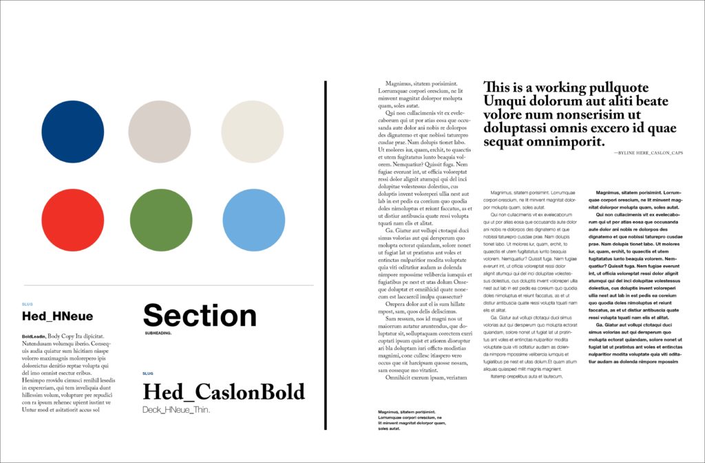
As an alumni magazine, Georgetown Business is, at its core, a brand magazine. As such, it was important to integrate the school’s fonts and colors into the system. Georgetown’s identity included their iconic blue with a bold selection of secondary colors, along with two classic fonts—Caslon and Helvetica. This palette allowed for a lot of flexibility in the design directions. However, it was essential to maintain an editorial look and feel to ensure that the final publication did not appear to be a marketing brochure.
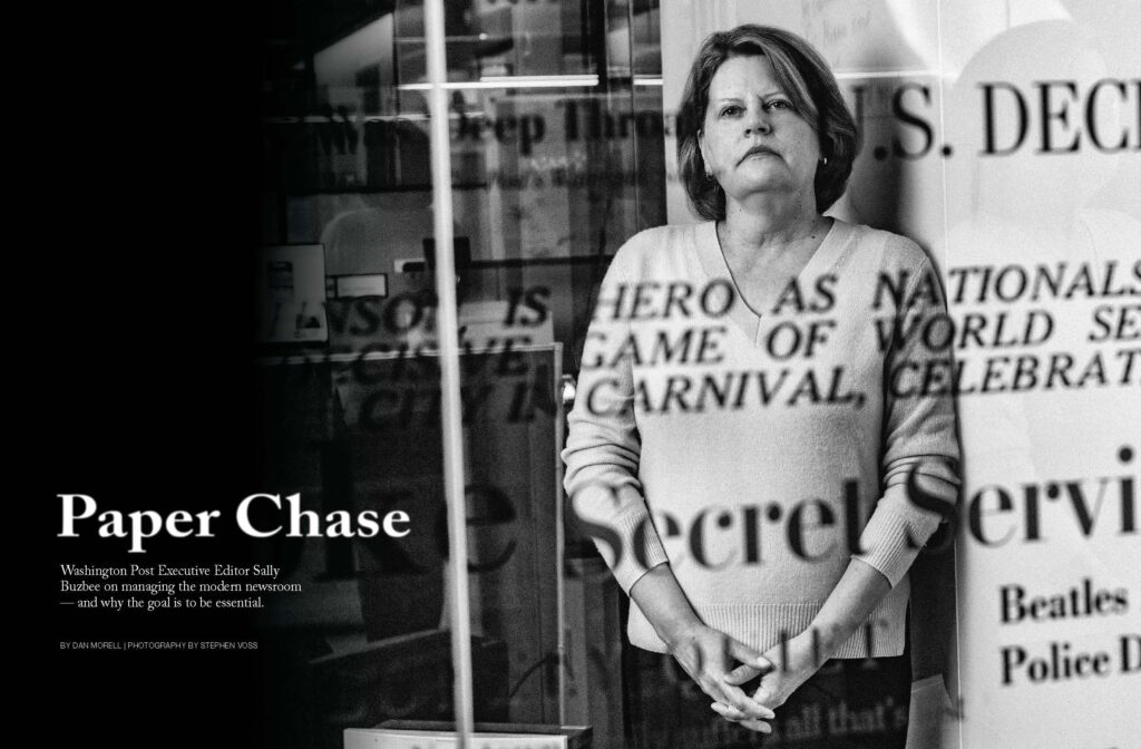
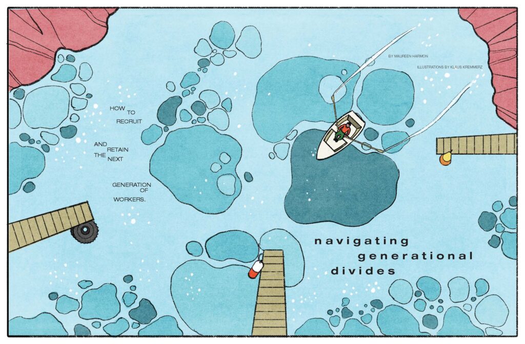
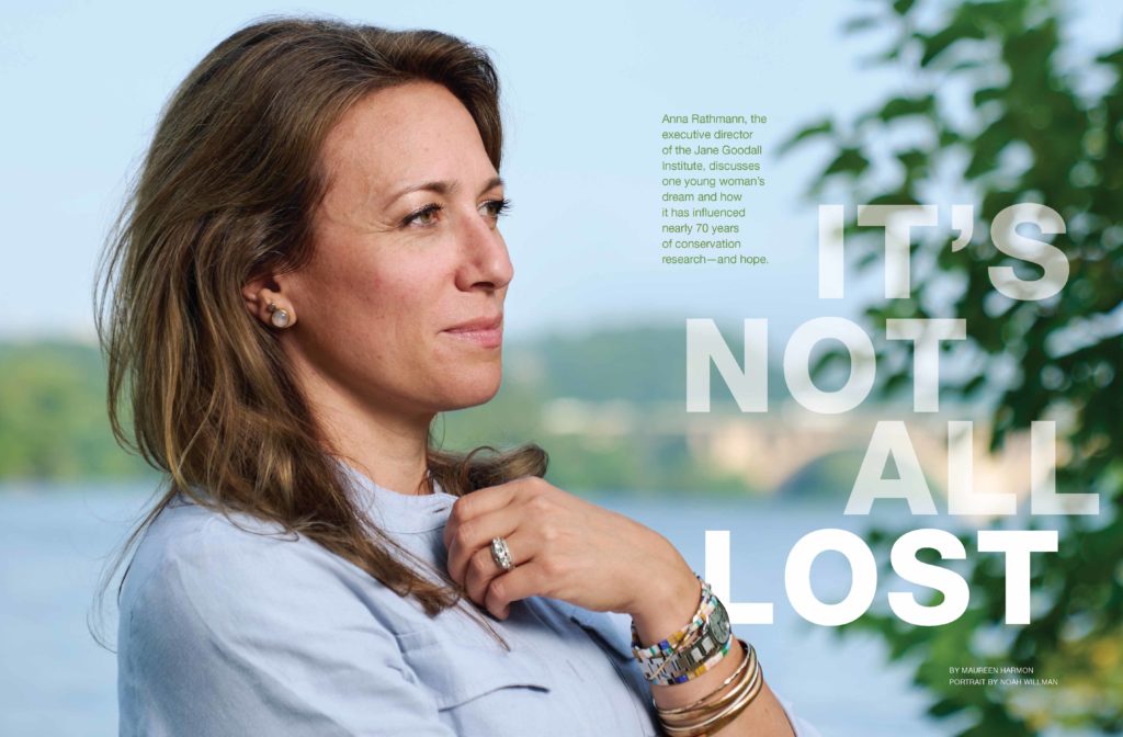
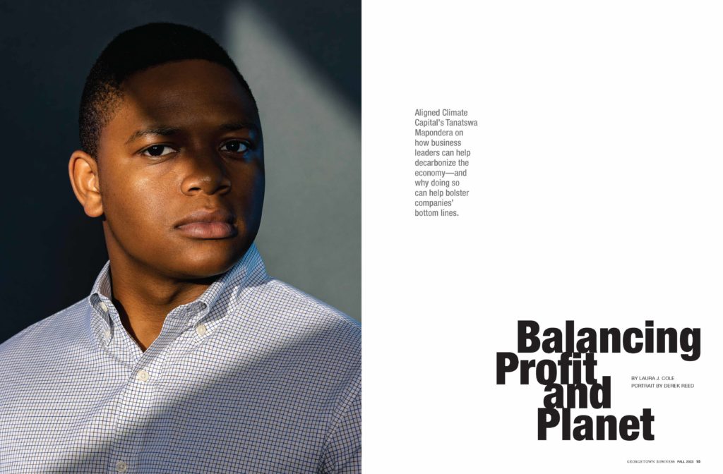
One of our primary objectives was to ensure that Georgetown Business neither read nor looked like a traditional alumni magazine. Using the identity guidelines as a foundation, and drawing inspiration from the school’s imagery, we developed a modern, understated magazine that speaks to the issues of today’s business world and highlights those in the Georgetown community who are making an impact.
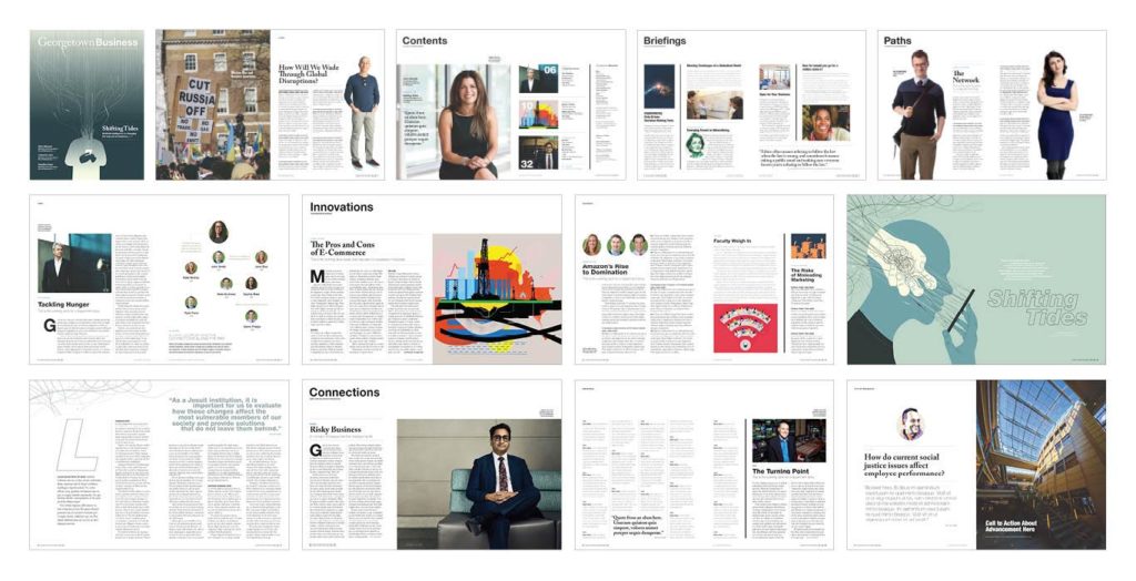
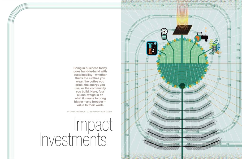
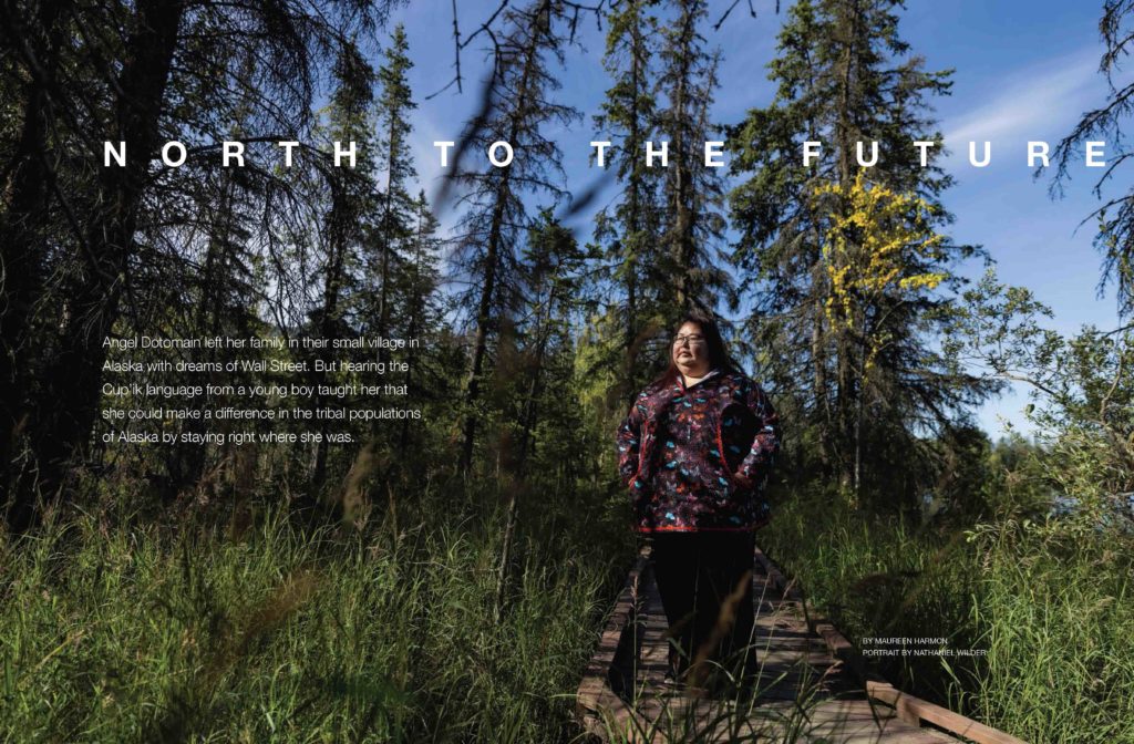
The 2communiqué team, including Dog Ear Creative, worked closely with Georgetown to develop the story list and editorial plan for the launch issue. The stories profiled people from around the world: Igor Smelyanski, the head of the Ukrainian postal service; Angel Dotomain, an Alaskan native who went back to her community to be the director of the Indian Health Services; multiple alumni working in the field of sustainability, including Mo Dewji, CEO of MeTL, the largest conglomerate in East Africa; and Melissa D’Arabian, a Disney executive who pivoted to become a Food Network star. We worked with talent from around the world to illustrate and photograph these amazing people. The result was a completely redesigned Georgetown Business that spoke to timely issues, featured captivating alumni, and broke through the clutter in a way that only Georgetown can.
