Work
A Liberal Arts School Magazine
Williams College
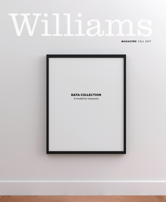
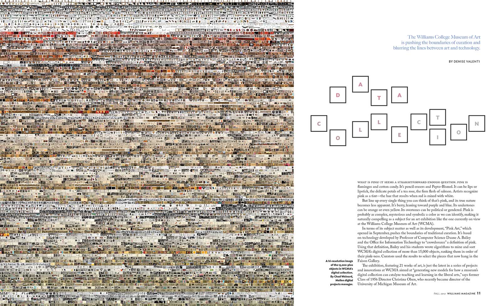
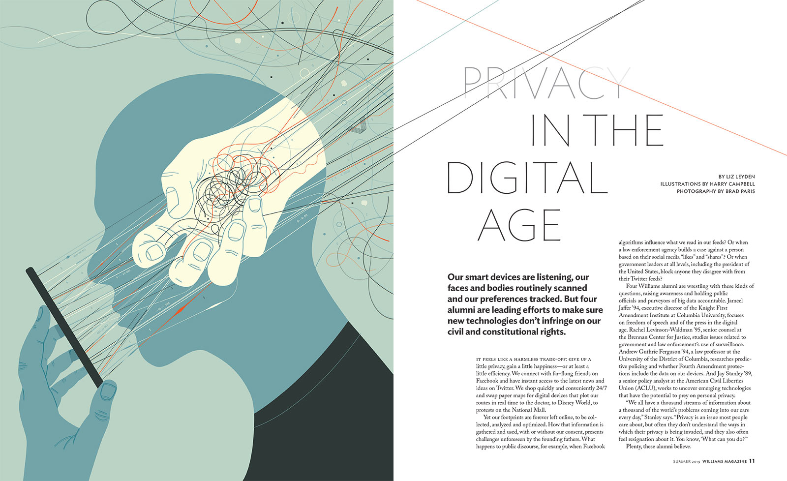
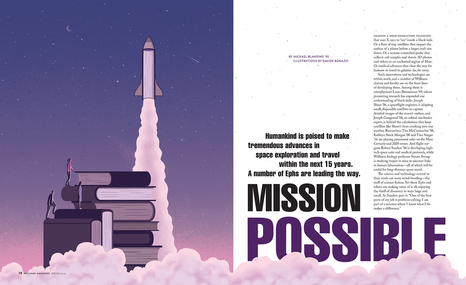
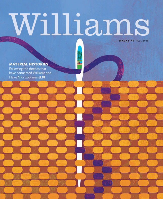
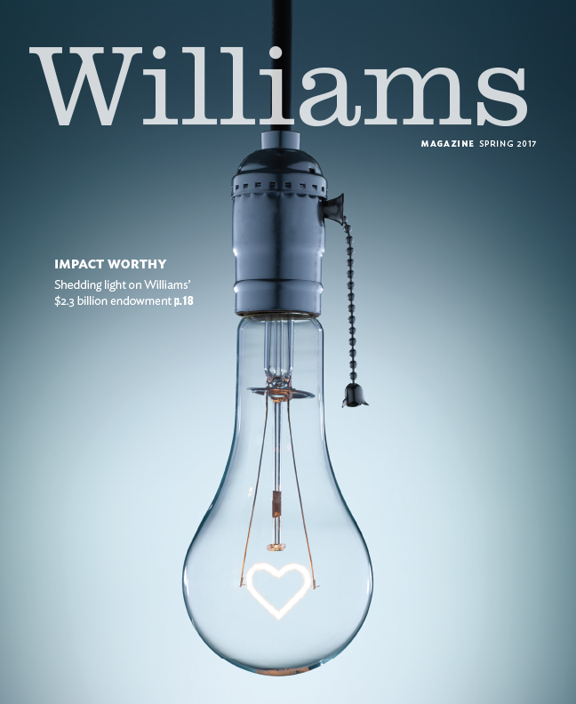
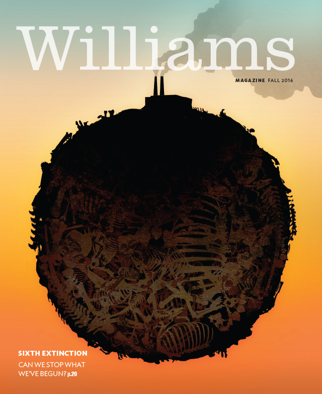
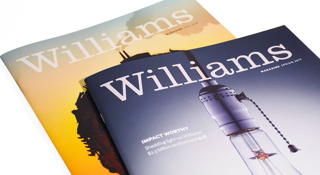
What started out as a refresh turned into a redesign for Williams Magazine. Although the magazine had great content, its pages felt flat due to dated typography, a muted color palette, and a stagnant use of the grid. Maintaining the same page count, we brought rhythm into the reading experience by alternating full-bleed imagery with dynamic page layouts, leading the reader from cover to cover. We collaborated with award-winning illustrators and photographers to create original work and incorporated archival imagery and staff photography to create visually arresting spreads throughout the feature well. White space flows throughout the pages, while the cover logo sits at the top of the cover, slightly transparent, like a white puffy cloud sits over the idyllic Williams campus in western Massachusetts.

