Work
An Authentic Experience
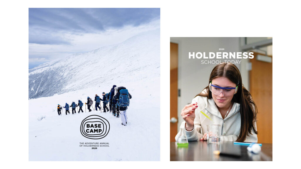
Basecamp: Holderness School Adventure Annual
Basecamp, The Adventure Annual for Holderness School is an ingenious idea by Holderness School. Instead of publishing two issues of Holderness School Today, the school now publishes Basecamp in the spring and Holderness School Today in the fall. The former emphasizes the Holderness experience and its deep connection to the outdoors—a key differentiator for prospective students—while the latter communicates with the alumni community through a more traditional alumni magazine structure.
This approach demonstrates how a print magazine can expand its reach—from an alumni magazine to an engaging admission publication.
As with all institutional magazines, it was important to align the new magazine with the school’s brand identity. We audited existing Holderness communications, including the outdoor program that Basecamp comes from and we looked at other adventure magazines to ensure this new magazine would align with the genre.
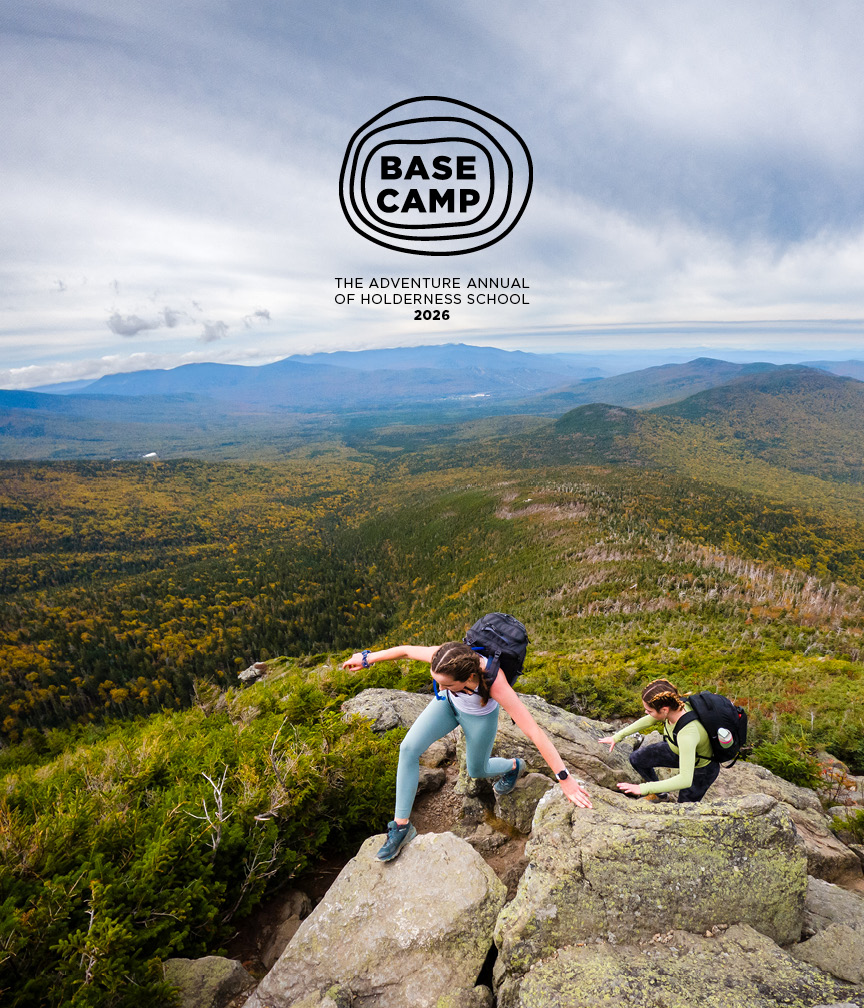
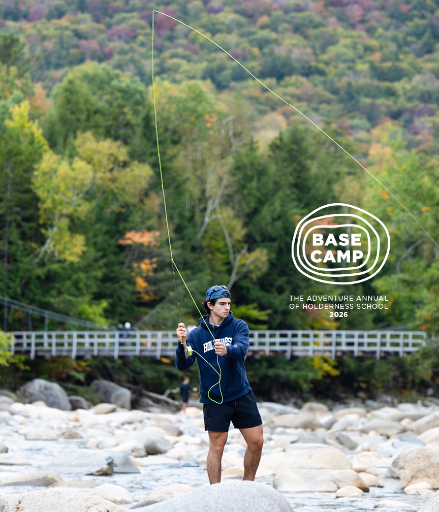
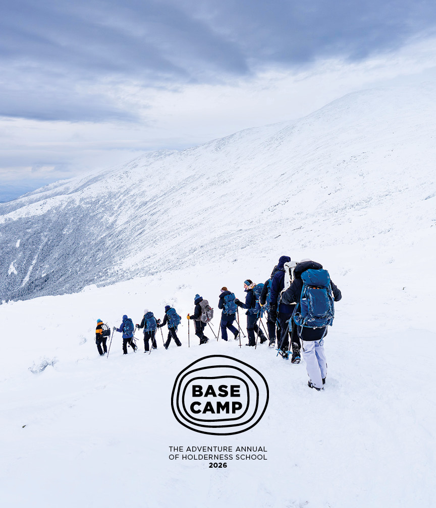
Basecamp (defined as a main encampment providing supplies, shelter, and communications for persons engaged in activities such as exploring or mountain climbing.), inspired a cover approach with a centered logo. As a circulation-based magazine, there is inherent flexibility to play with cover composition since the publication does not contend with newsstand placement.
A revised version of the logo, based on a concept created by Holderness team member, Alex Molloy, paired the wordmark with amorphic shapes inspired by the contours of a topographic map. We continued exploring composition and placement, drawing on the directional relationships of East, West, North, South.
The final placement limited the cover to top and bottom placement.
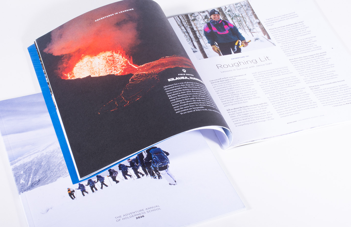
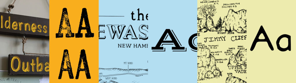
Working from the Holderness brand identity, we expanded the palettes to represent the tone and direction for the new journal: authentic, bold, curious, approachable, and inspiring. We added colors that capture the experience of being outdoors, including sky blue, first floor, summer leaves, dusk, and sunshine. We introduced fonts for the feature stories to reflect the outdoorsy, casual aesthetic found in maps and etchings.
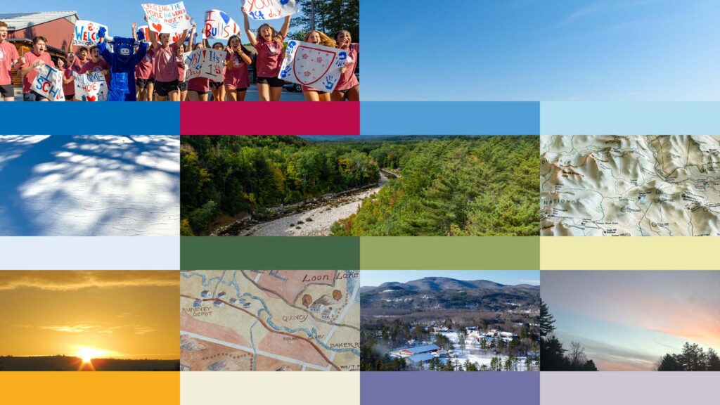
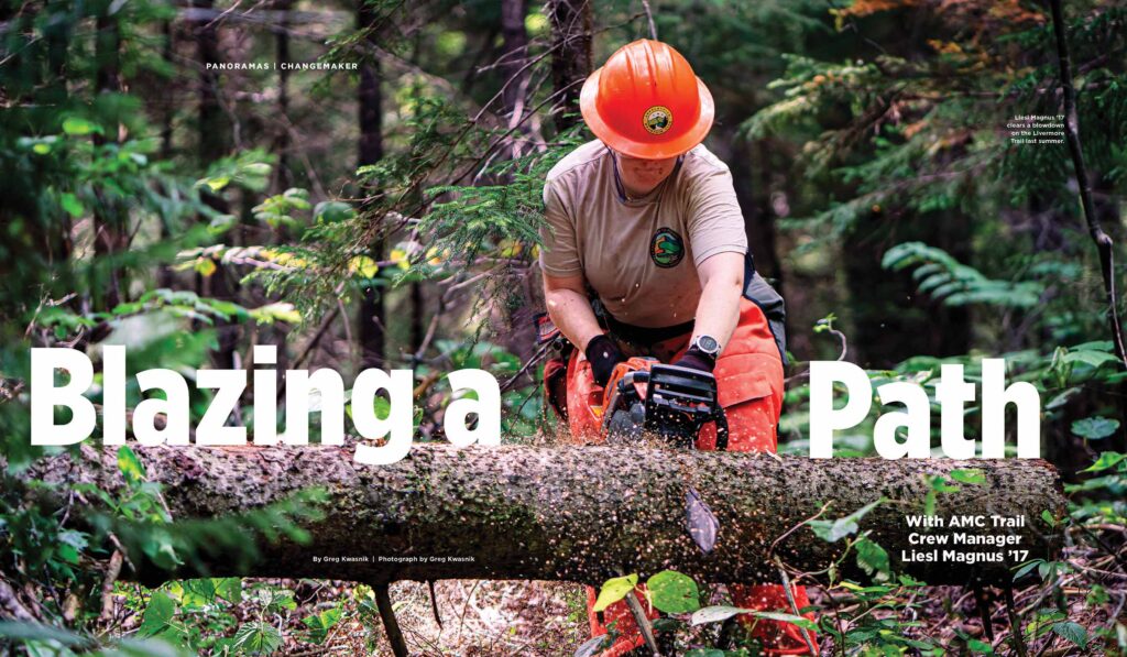
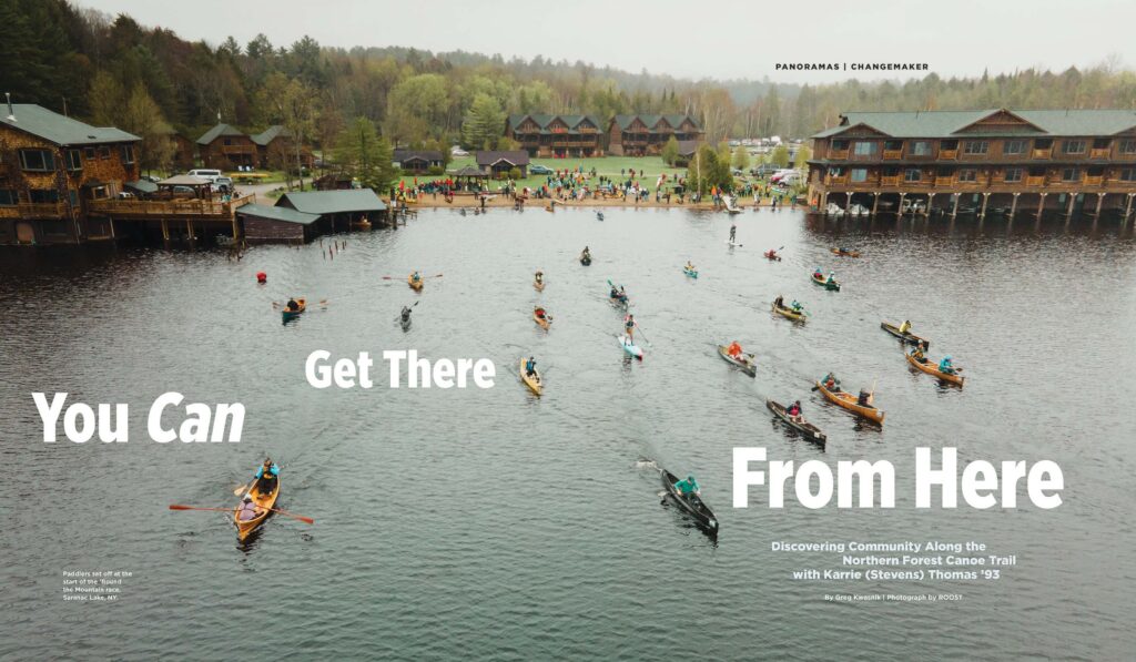
The color and typography are the foundation for a visually arresting publication. With two professional photographers on the Holderness communications team, we designed a publication to showcase their work using full-bleed spreads and dynamic image montages. The goal was to capture the immersive experience of the outdoors, from whitewater rafting to log cutting.
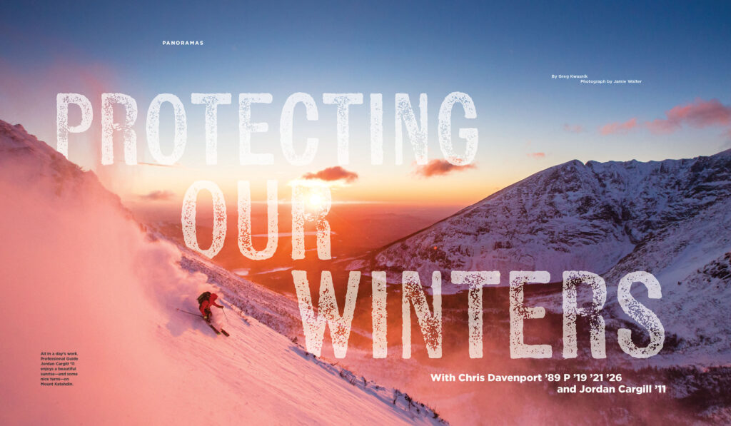
We recommended a larger format for the new adventure journal to highlight captivating photography. The smaller format suggested for Holderness School Today was meant to represent the close-knit, small community at the school. By developing the adventure journal and redesigning Holderness School Today, we created sibling publications that complement each other to tell the full story of Holderness.