Work
The Essence of Place
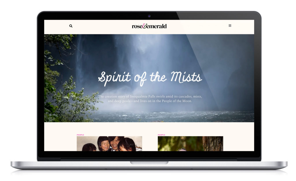
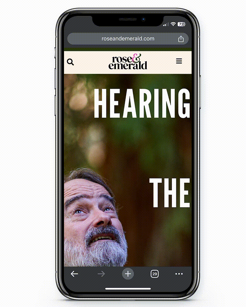
Rose&Emerald Identity & Digital Publication
How do you capture a place—its history, culture, people? How do you bring people from around the world to that place? These are questions that we ask when creating communications for clients in education. Those were the same questions we addressed in developing an identity and digital publication for Rose&Emerald. The answer: Through a clearly defined mission, identity, and approach to storytelling.
Understanding a sense of place is crucial to any project that is informed by location. Typically we are looking at a campus but for this project, it was a region—the Pacific Northwest (PNW). We were not able to travel to the PNW, but fortunately, we were provided with an extensive photo library from Rose & Emerald that we supplemented with additional photo research. While not quite the same as visiting a place, we learned to utilize this form of research during the pandemic when travel was an issue.
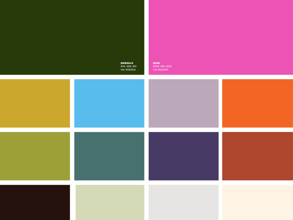
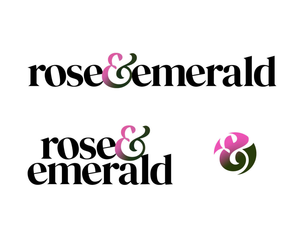
Our findings led to a rich natural color palette with pops of color that was influenced by the vibrant nature paired with the urban funkiness of Portland and Seattle. An emerald green and bright pink set the stage as the primary colors, representing the trees and first roses brought to the region.
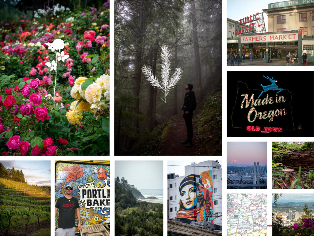
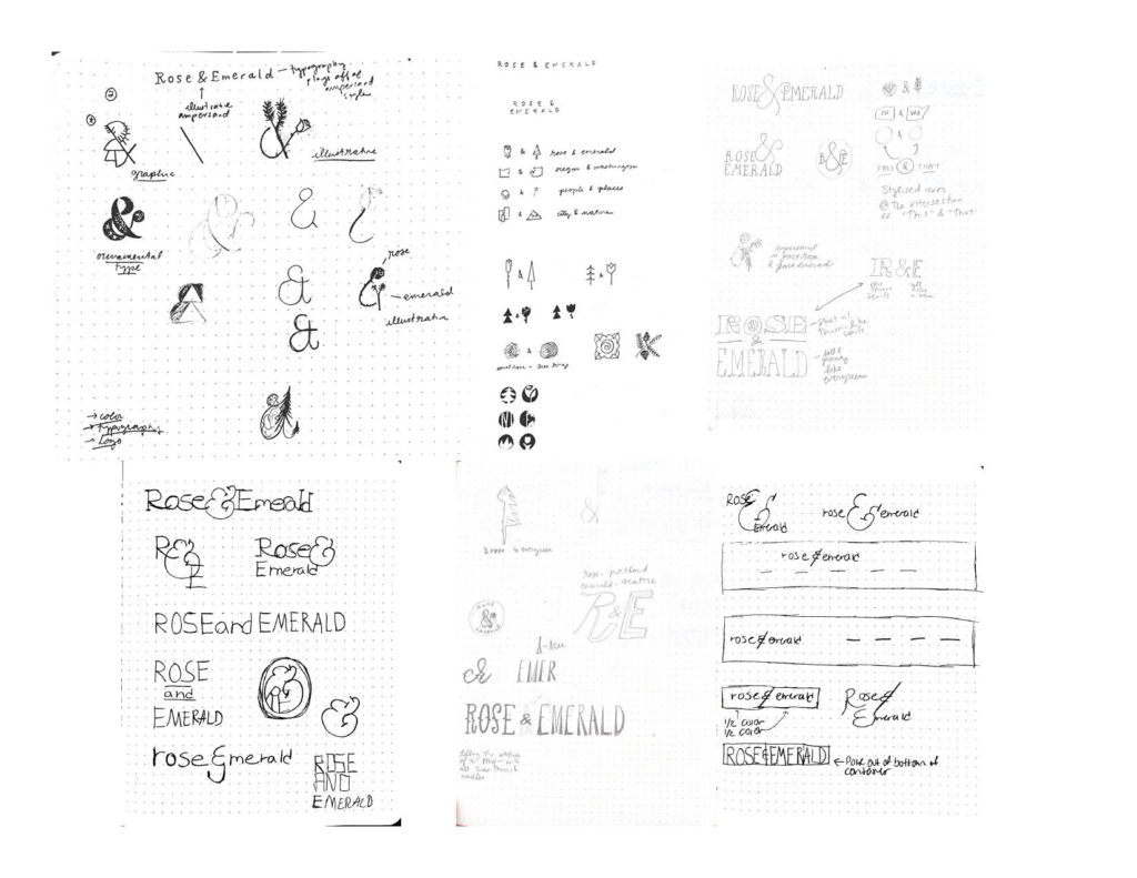
The idea of bringing two cities and multiple states together as a unified region drove many of our ideas. How could we explore the Portland, Oregon region (Rose) and pair it with the Seattle, Washington region (Emerald)? It is always a bonus when you have an ampersand in the mark—what a gorgeous character!
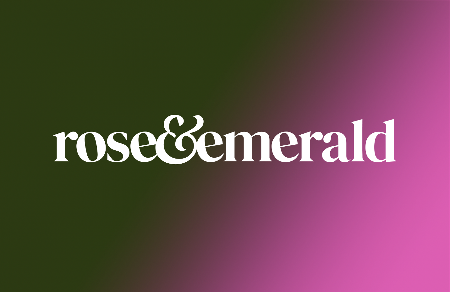
An important consideration with any identity is the primary use. Knowing that Rose&Emerald is a digital publication we wanted a logo that was typographic and would work across a variety of platforms, including desktop, mobile, and social media. After sharing four different directions, we collectively landed on the lowercase version set in black type for an editorial feel that included subtle details in the orientation of the letters to give a nod to the quirkiness of the region. The final version with a graduated ampersand included options for horizontal, stacked, and a social media alternate.

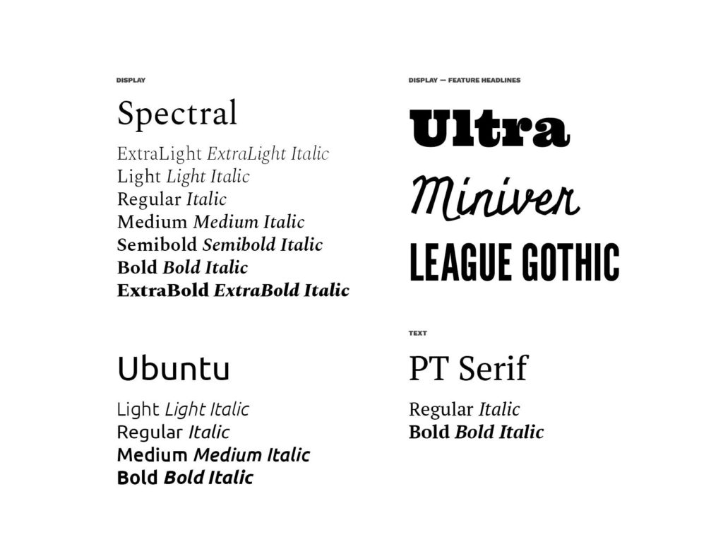
For any identity, the type palette is a crucial component. In creating the type palette for Rose & Emerald we looked to our research and final use. What characteristics were we seeing in the landscape and signage? What selections will read best on screen? For a digital publication legibility along with brand personality is key. We are always surprised when a client shares an existing identity guideline and it does not include fonts for body copy. For an editorial identity, legibility in large blocks of text is imperative.
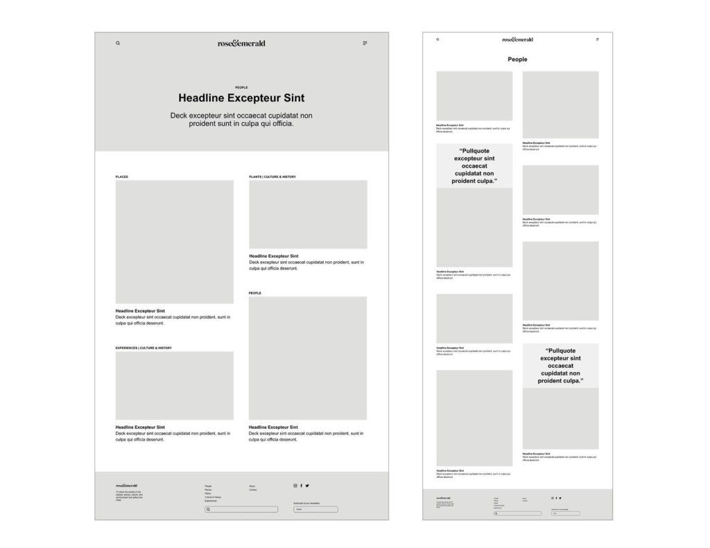
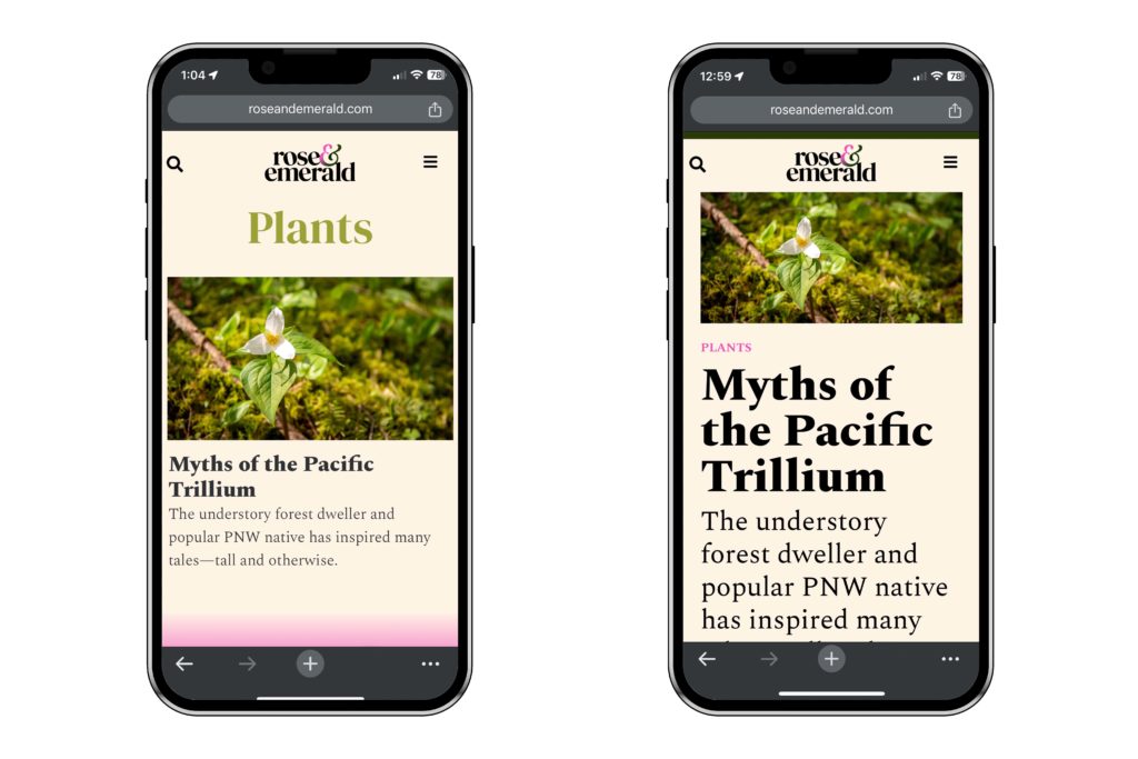
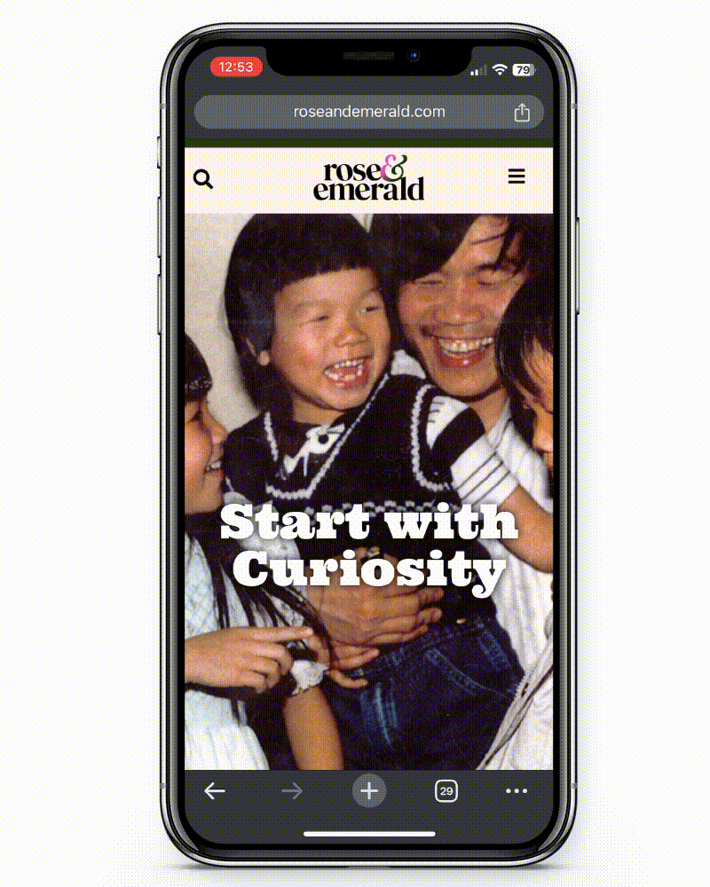
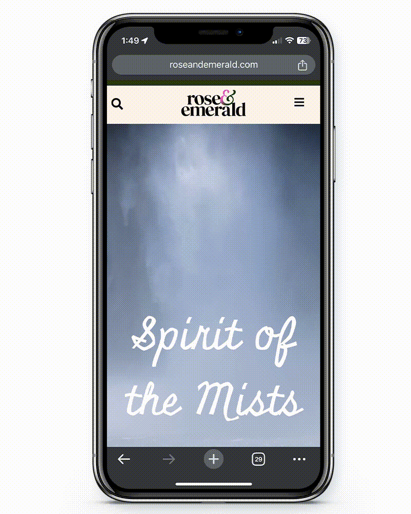
The design of any publication begins with a comp. In the case of a digital publication, this becomes a wireframe. A reader’s experience with print explores the composition of the page, the flow from cover to cover, and entry points to pull a reader in. A digital experience also considers the composition of the page, yet unlike print there is not a linear interaction or the assumption that they will land on the home page. For Rose&Emerald we considered multiple entry points users may have to the site—from a curated “further reading” section at the end of each article to a curated tagging system for ease of navigating content. Creating the information architecture and user interactions for the website leads to a positive user experience.
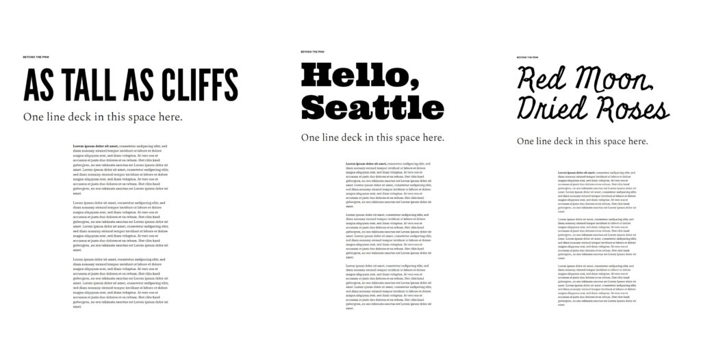
What is a constant between print and digital is the need for a clear identity, including the logo, typography and color palette, image direction, and designed experiences. For Rose&Emerald we created templates for short-form articles to allow for ease of publishing. Each feature is thoughtfully designed to capture the essence of the article through the relationship between type and image and pacing through the content.
Rose&Emerald speaks to people in the region and beyond. We know now that we want to visit the PNW more than ever.