Work
Re-envisioning to Reflect Place
University of Albany / UAlbany Magazine
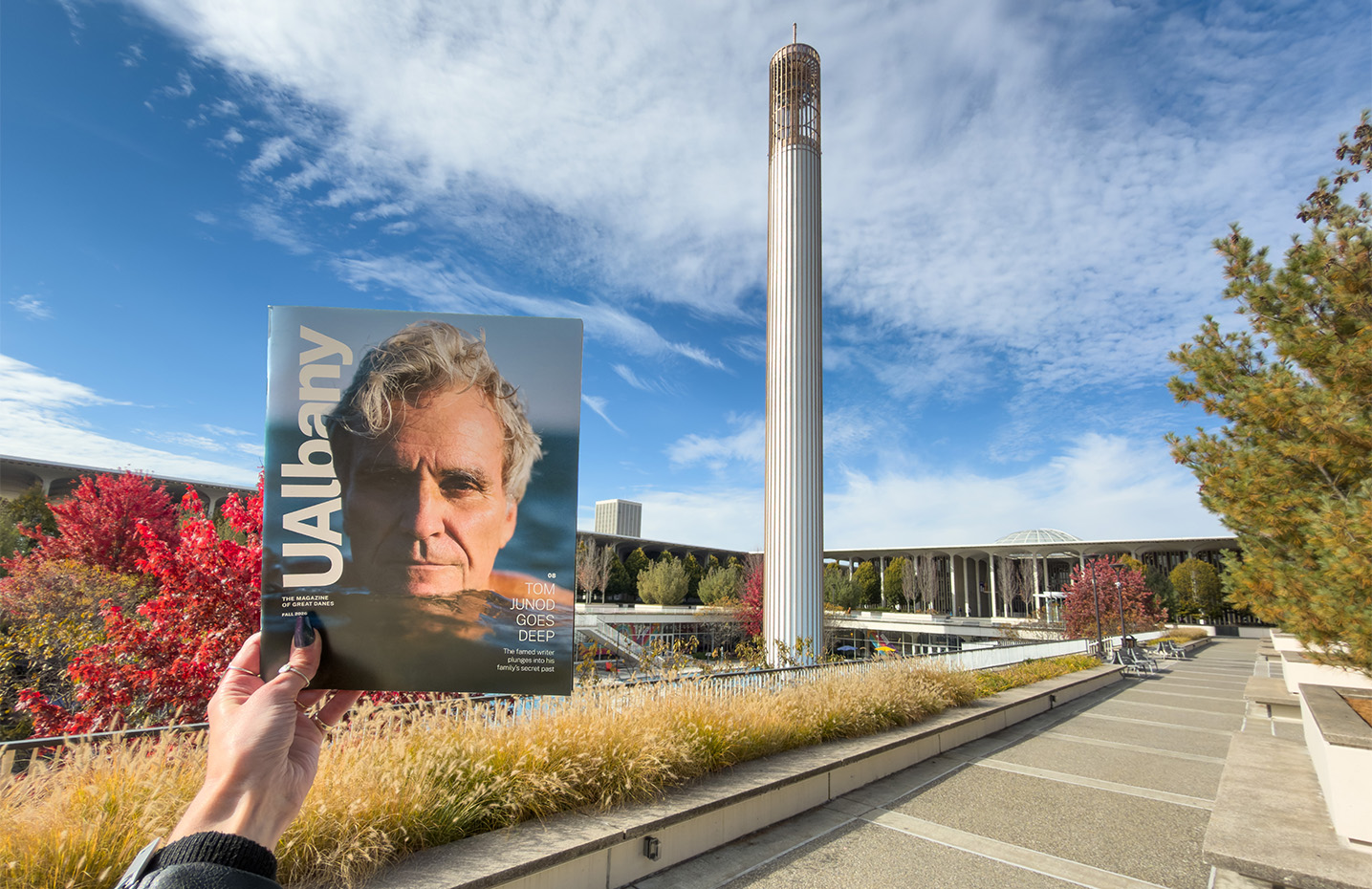
Redesigning a magazine is an investment in time and resources; and is a project that is typically taken on once a decade. For that reason, it is worth investing in a complete re-envisioning of the magazine. This entails onsite discovery, a communication audit, editorial critique, and editorial plan along with a new look-and-feel. UAlbany Magazine had implemented tweaks to the design over the past decade and launched the popular online Mag Mini—it was time for a complete overhaul of both the print and online magazine.
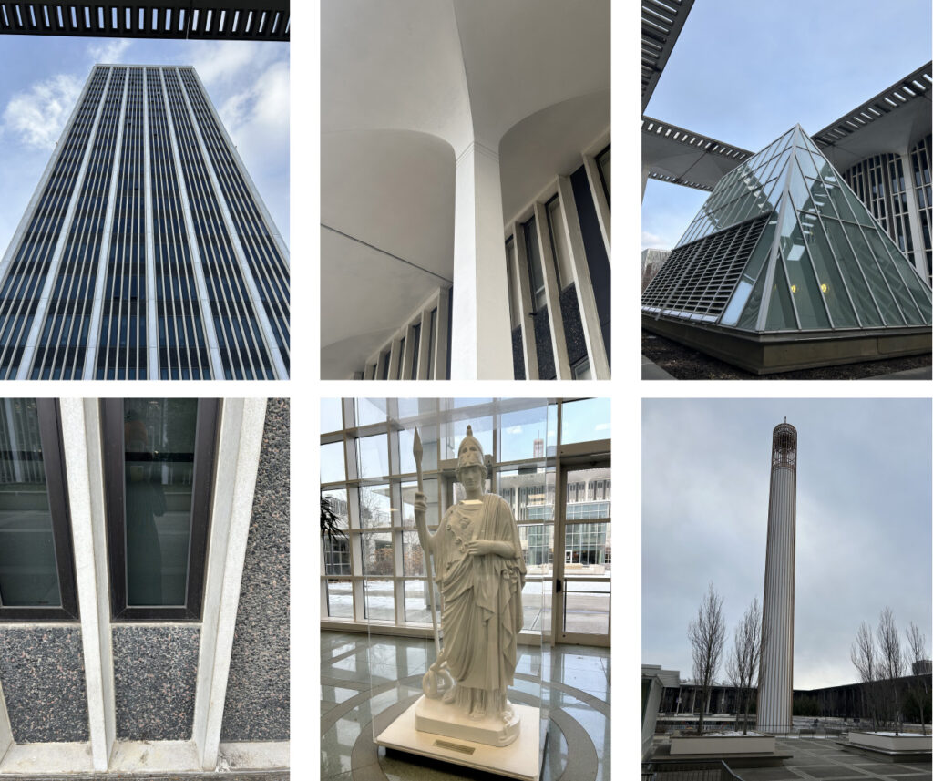
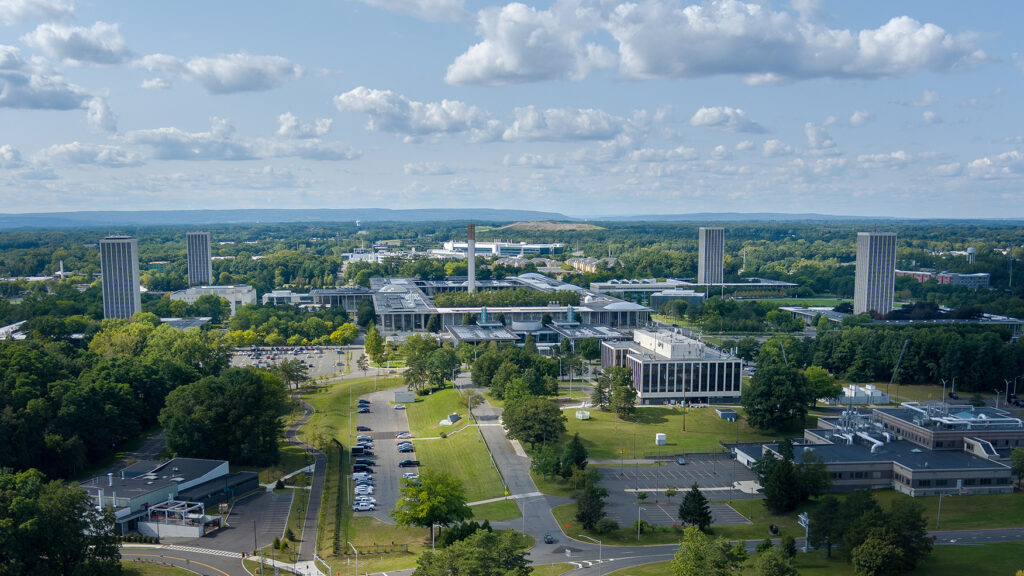
What was particularly exciting about this project was UAlbany is in our hometown so we were familiar with the school, including previous in-house experience for our Strategic Partner, Michelle Lansing. That said, the onsite tour and information gathered from our interviews and focus groups gave us deeper insights into how the community perceived the university and flagship magazine.
Along with discovering the magazine is well regarded and UAlbany has a passionate student base, we learned that one of its strengths is how the magazine is produced. Like all of our clients, the magazine team is lean and juggles many other projects. To create a top-notch magazine on a limited budget, Senior Director of Advancement Communications Paul Miller has built a network of UAlbany talent who respect the magazine and want to be part of it. He also attends meetings with other campus departments to learn firsthand about campus and alumni stories. The result is a balanced and deeply informed magazine rich with relevant content.
While the 2C team was deep in discovery, our strategic partner, Editorial Strategist Laura Cole, was on the other side of the country working on the Editorial Critique, having never visited the Albany campus before her insights were pulled from the magazine and additional online research. Her recommendations included reigning in the personality to better reflect an R1 University and show off the accomplishment and alumni success more.
The Discovery Report and Editorial Critique feedback was well received so we knew we had a solid foundation to develop the Editorial Plan.
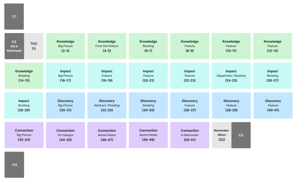
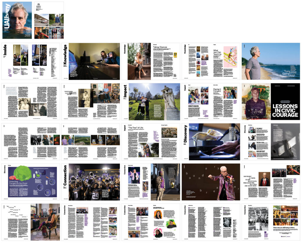
Breaking with the traditional format, Laura recommended a magazine made up of four core sections. This unique approach drew on inspiration from two enduring elements of the University at Albany’s identity: the quads that shape the physical rhythm of campus life and Minerva, the university’s enduring symbol.
- Knowledge reflects Minerva as the goddess of wisdom, the university’s deep commitment to learning, scholarship, and the pursuit of ideas, and roots as a teachers college.
- Impact plays up UAlbany’s tradition of commitment to the public good while drawing on Minerva’s role in the Capitoline Triad
- Discovery is a nod to UAlbany’s vision to be the nation’s leading diverse public research university and Minerva’s epithet as the Goddess of Thousand Works and association with strategic thought, invention, and the arts
- Connection speaks to Minerva as a weaver and symbol of community.
Along with creating an Editorial Plan that is unique to a school’s identity, it is important to integrate the brand identity. UAlbany had just completed a brand identity audit and refinement; as one of the most visible communications, it was imperative the magazine reflect the new direction while maintaining the magazine’s brand personality: Bright, inspiring, creative, empowering, and proud. The solution was to create a subbrand that felt younger and more expressive of the diverse public research university.
Our design directions explored dozens of different images to capture the brand personality as well as representing various ways the people-driven covers could be handled, including modifying supplied portraits and directing original portrait photography and illustration. The images were then complemented by the traditional university wordmark or enhanced with a new vertical orientation of the existing workmark to represent the iconic Carillon and the upward motion that is core to attending an R1 University. The vertical orientation was selected by all campus stakeholders and became the foundation for the interior page design.


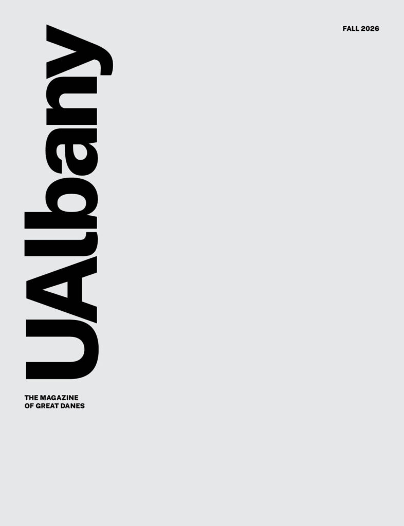
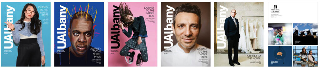
The new Editorial Plan and Visual Direction was implemented in the Fall 2026 issue. From cover-to-cover the experience represents UAlbany, from the captivating cover story about Tom Junod written by UAlbany’s Paul Grondahl; the engaging Big Pictures photographs that introduce each section taken by UAlbany’s in-house photographer, Patrick Dodson; and original illustrations by Erick Ramos, Alex Williamson, and Kotryna Zukauskaite.
Not every school has the budget to complete a comprehensive re-envisioning of their magazine, and a visual redesign can be the solution to freshen up a magazine and make it more relevant. But if a bit more budget can be invested, the result is a truly re-envisioned magazine that will be relevant for years to come.